First steps
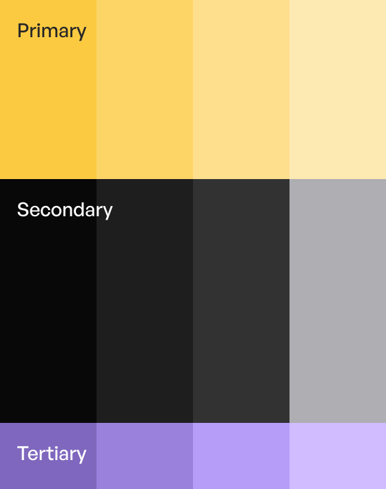
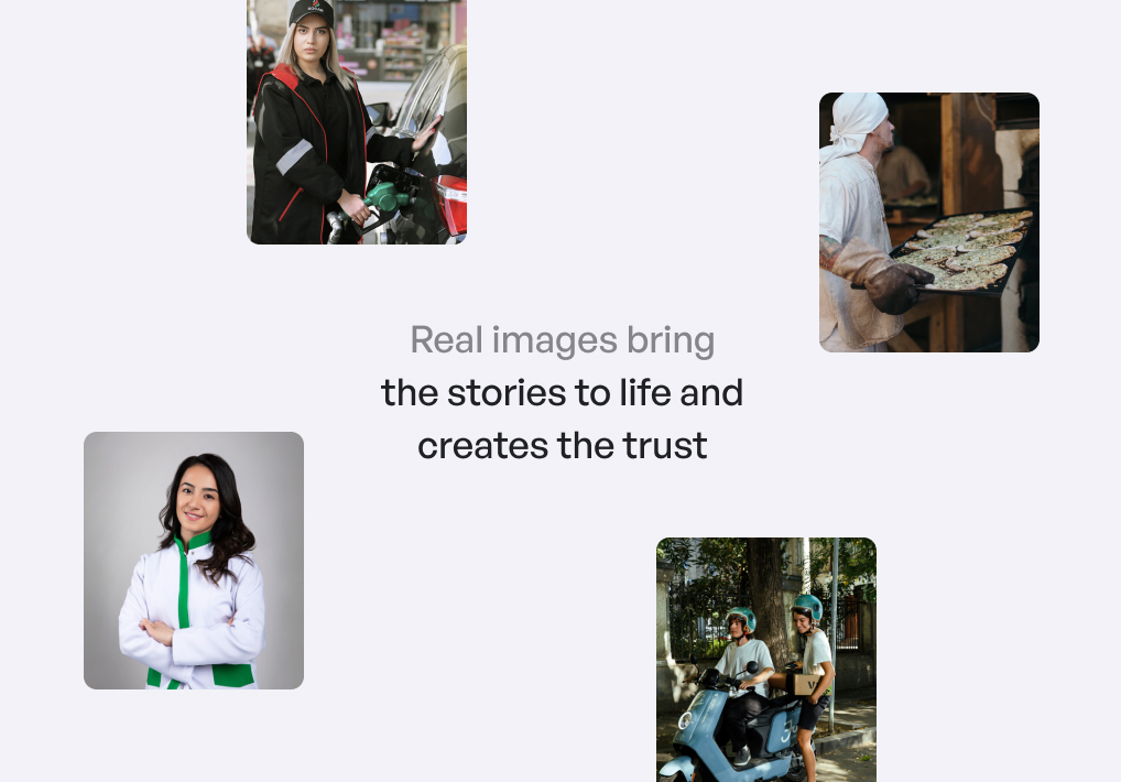
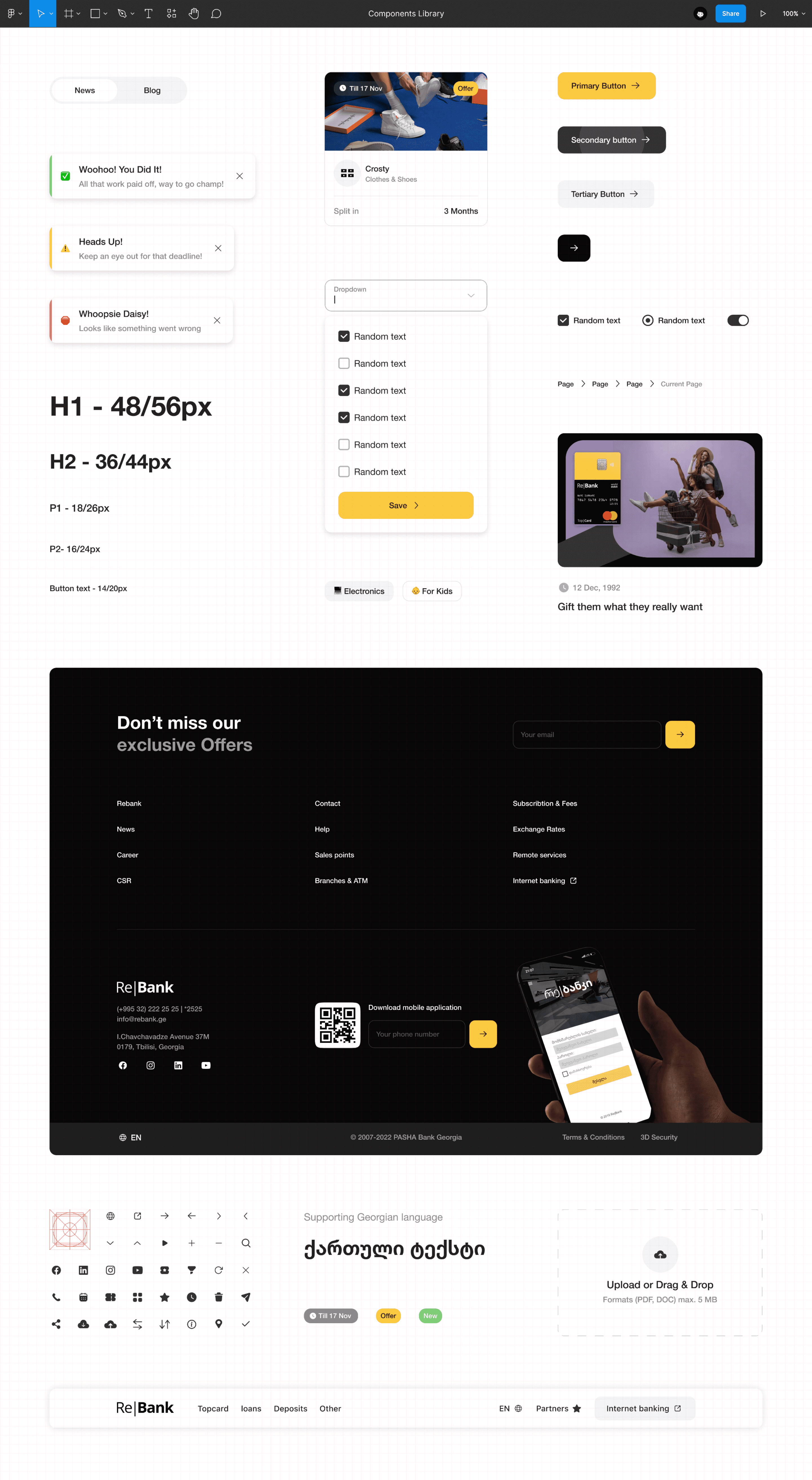
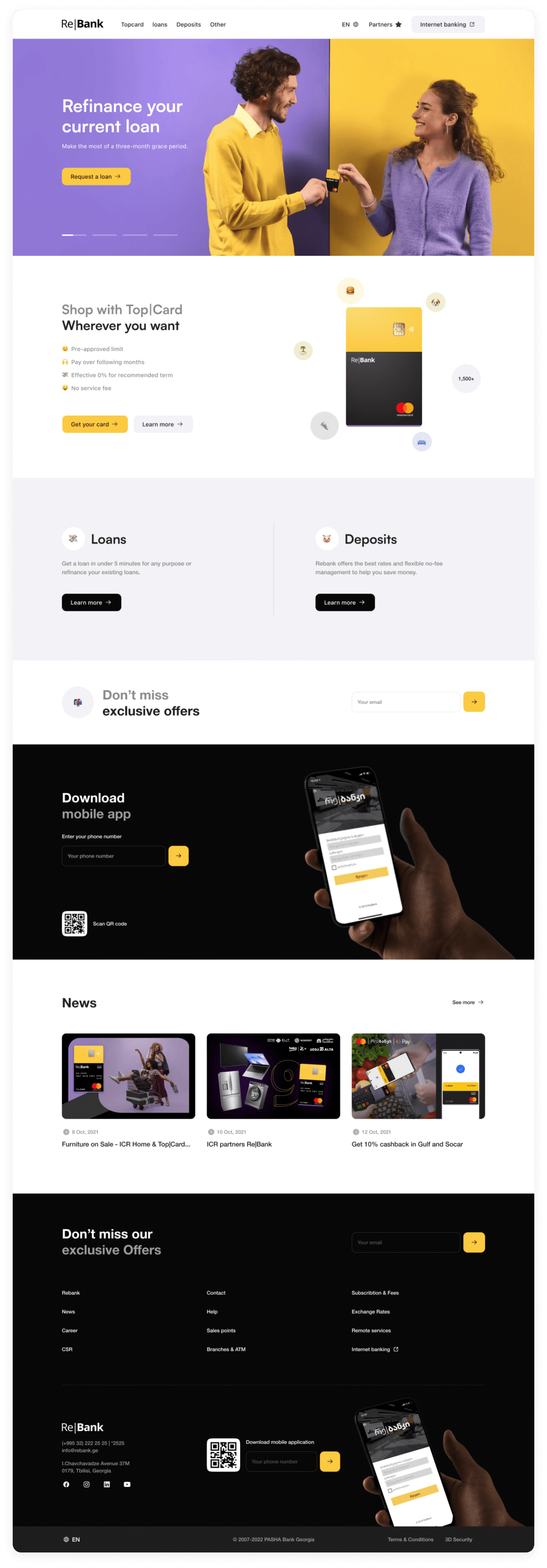
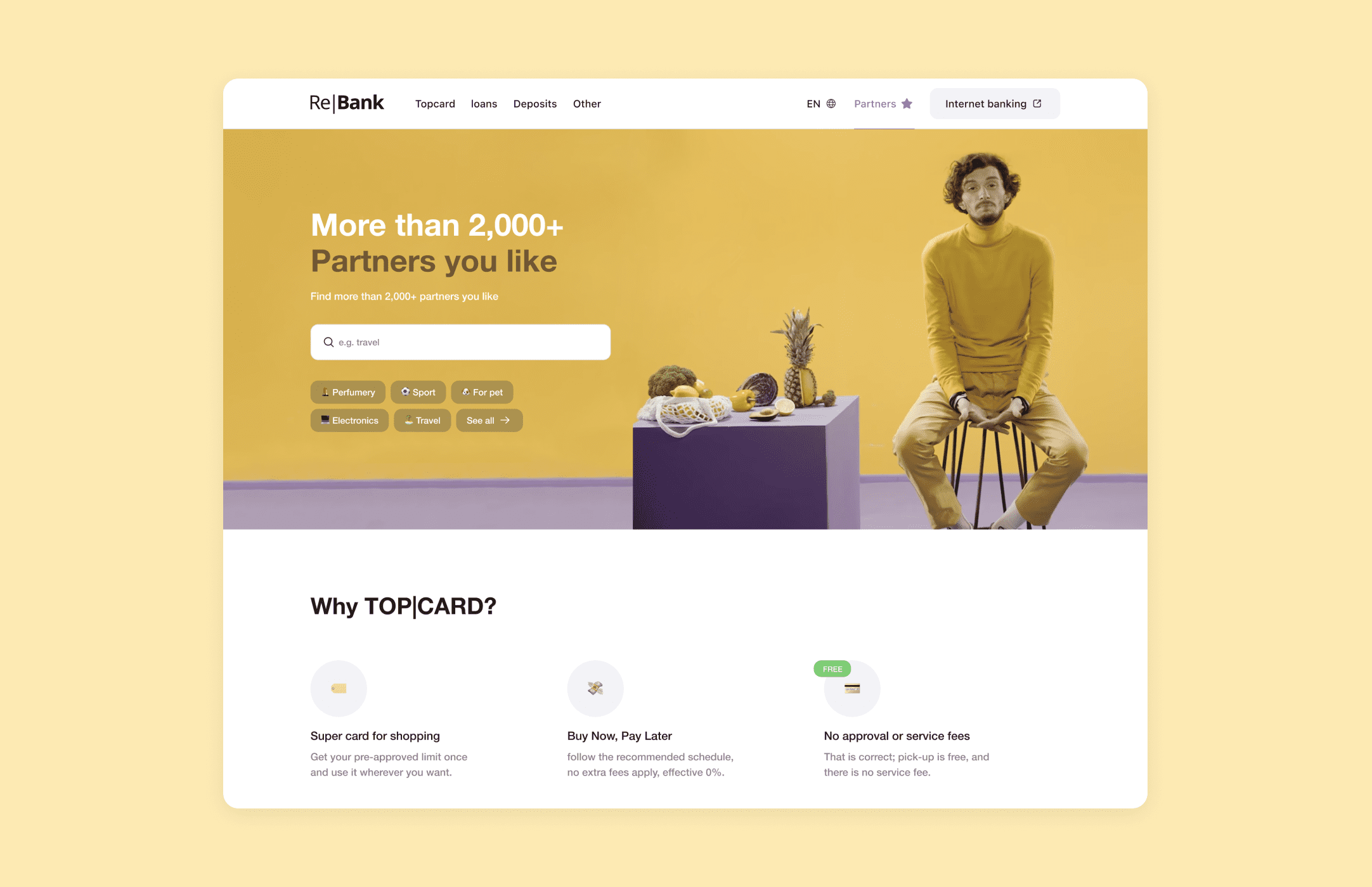
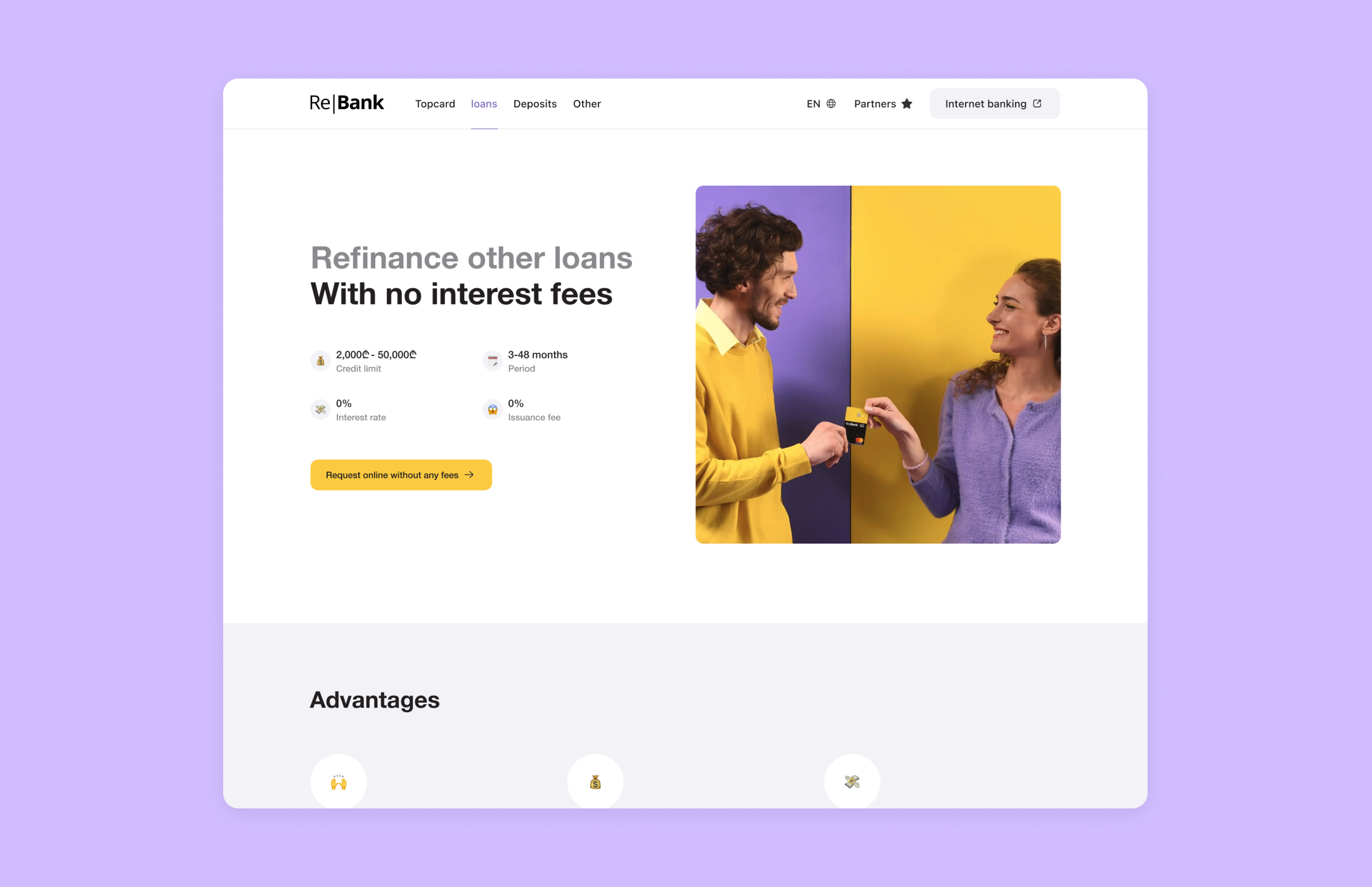
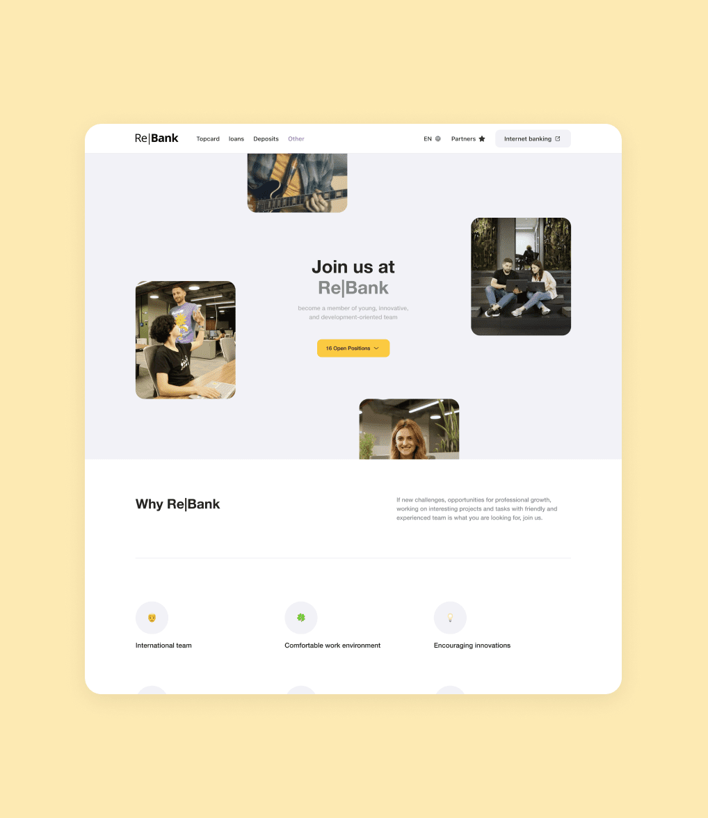
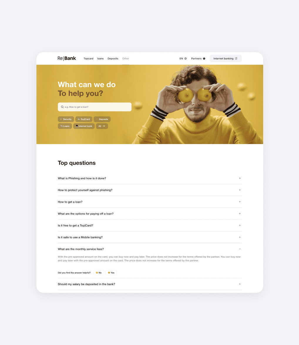
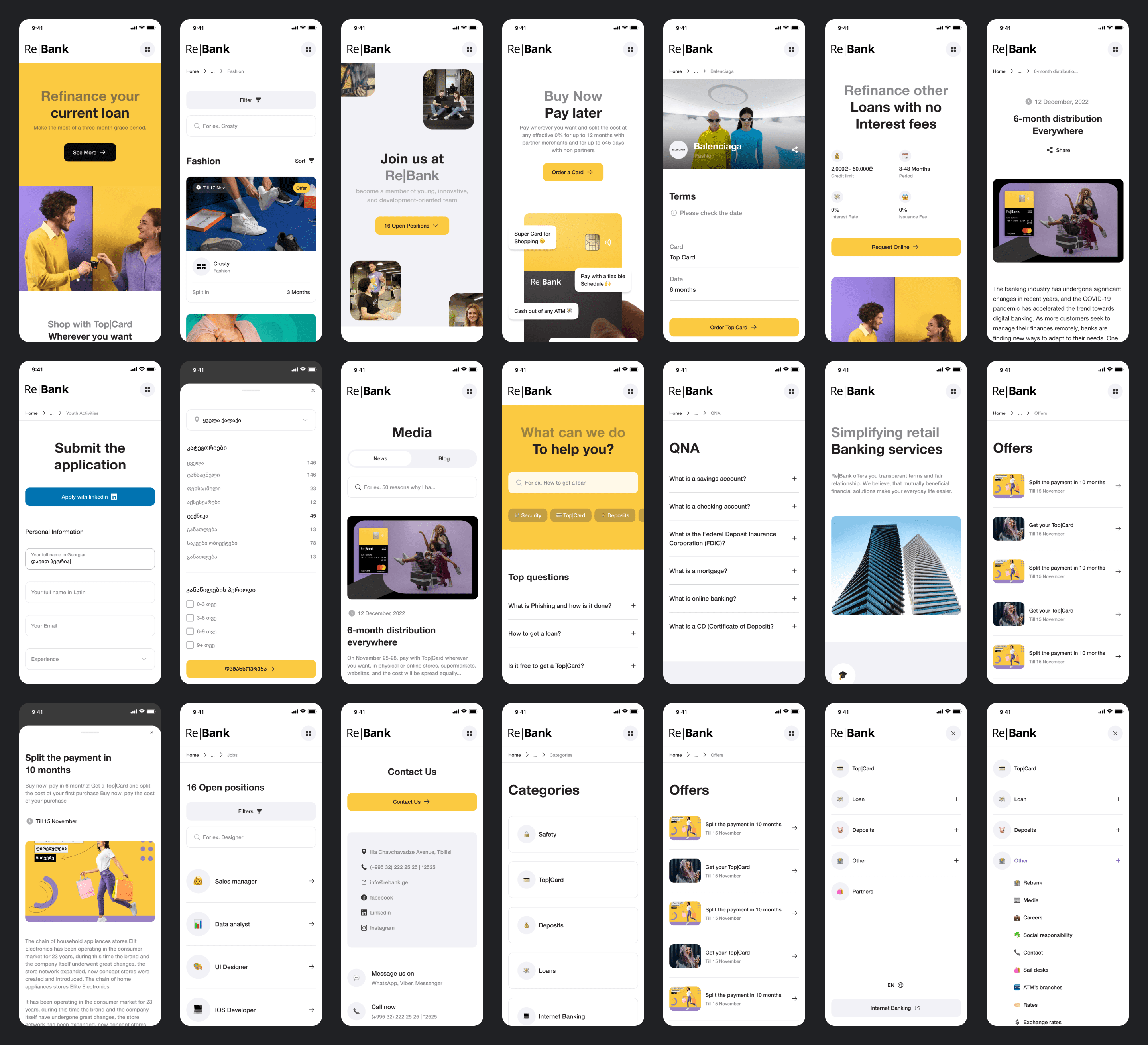
At the beginning of the project, my main focus was to create a delightful color palette and a style guide for their website. During my research, I discovered that one of their biggest challenges was gaining the trust of users. Many people felt that the company was just another tech giant, not really designed with human needs in mind. To tackle this issue, I came up with an exciting idea: using captivating images of real people and sharing their authentic stories about how they use the bank. This way, we could showcase the human side of the company and build trust among visitors.
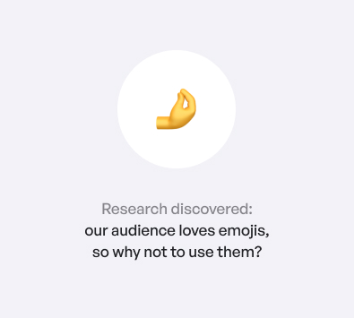
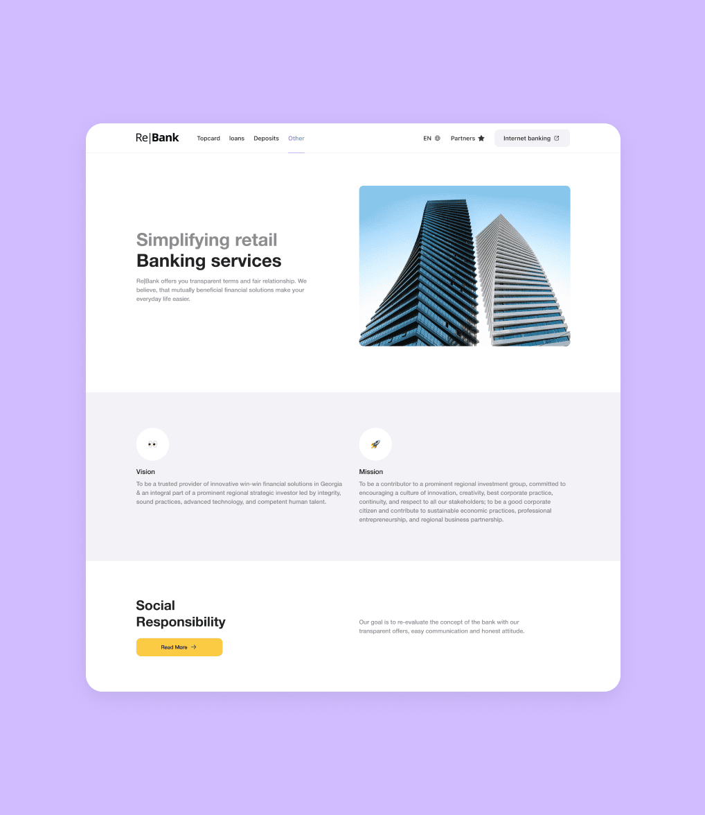
Another interesting insight I found during my research was that the target audience absolutely loved emojis. They were using them everywhere, so I thought, “Why not bring some of that fun and playfulness to the website?” I decided to incorporate emojis into the design, replacing some of the boring default icons. This not only added a touch of personality but also resonated with the users on a more emotional level.
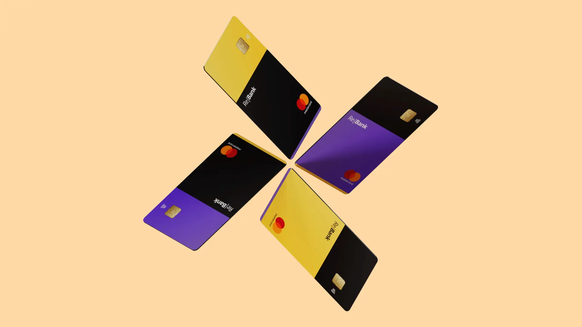
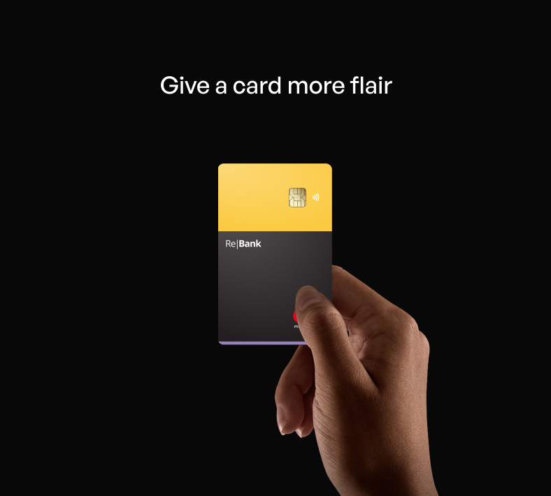
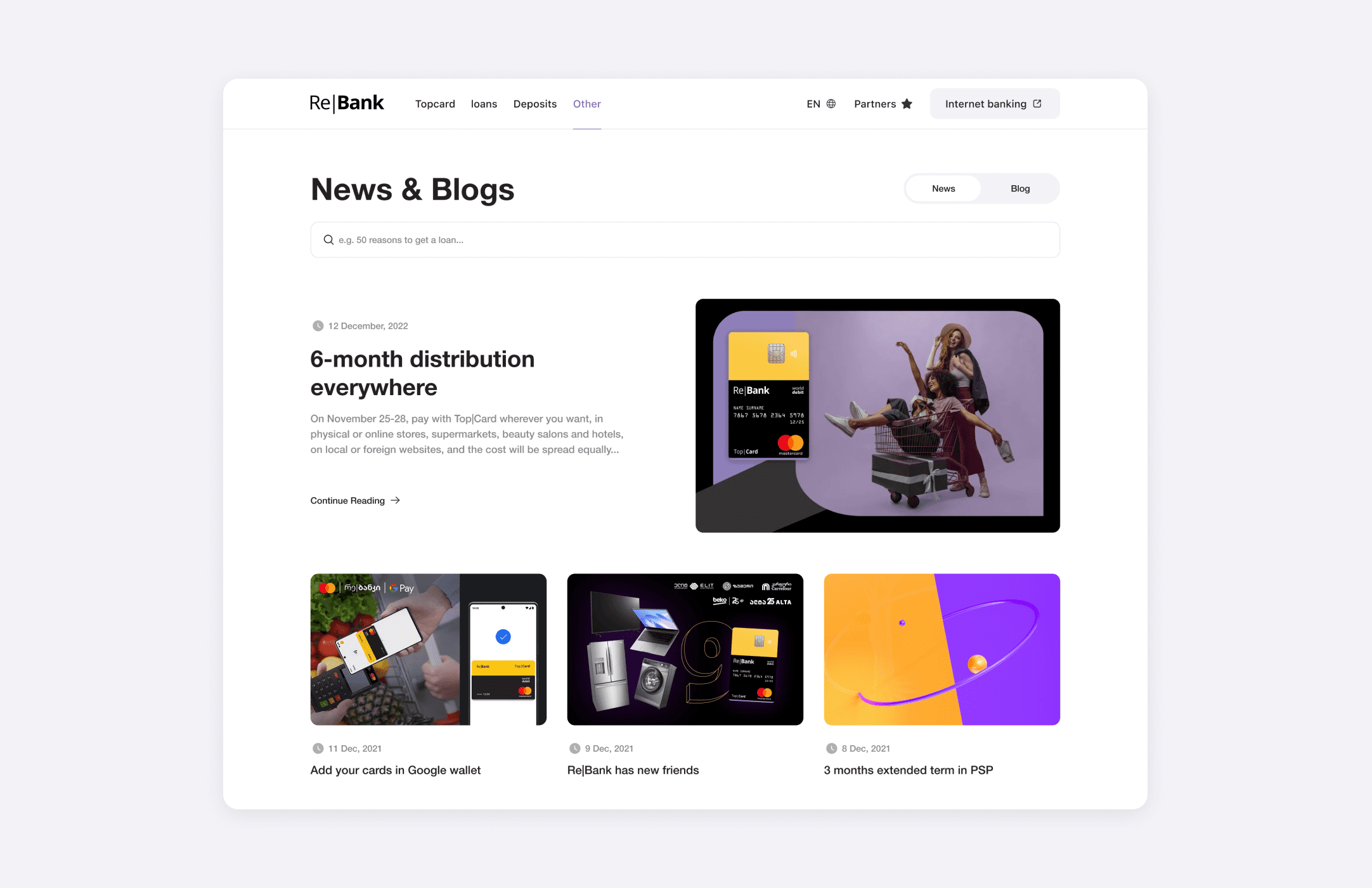
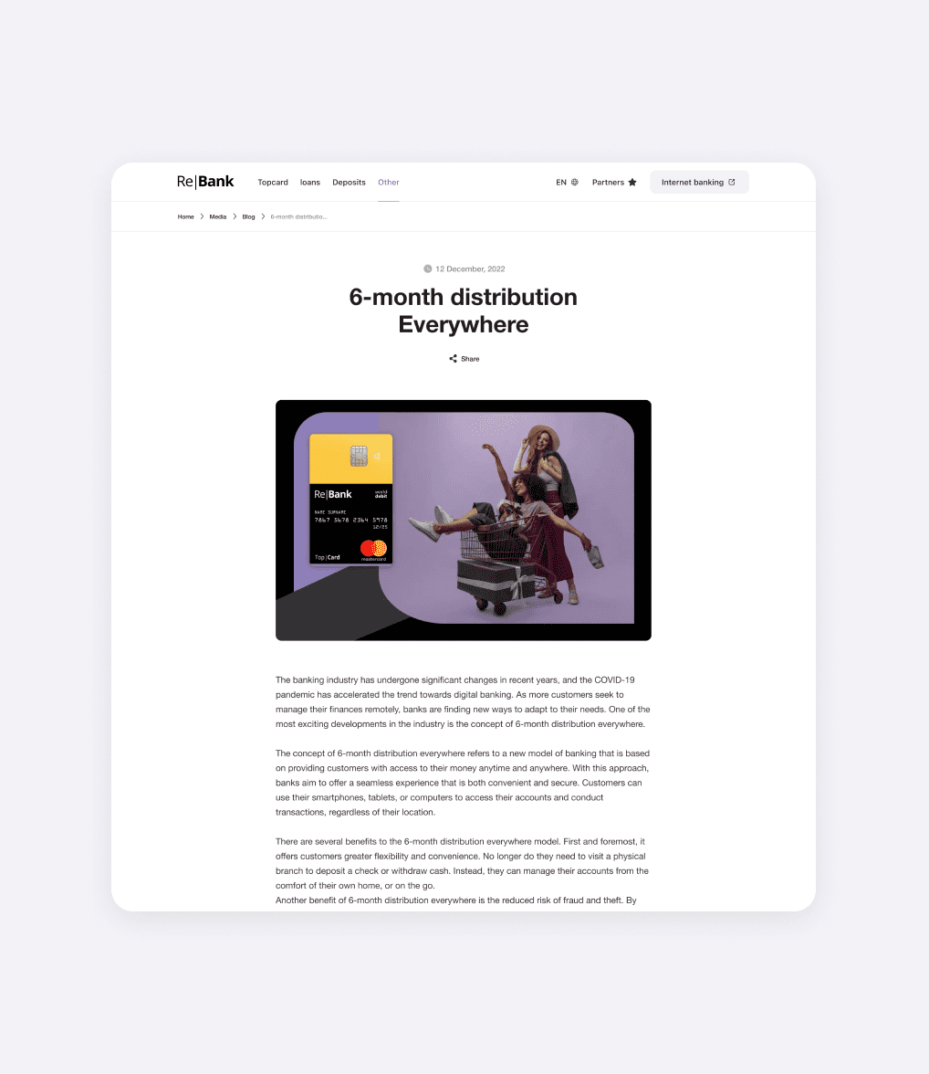
Furthermore, I noticed that the bank’s card, which is one of its standout features and advantages, was not getting the attention it deserved on the website. So, I made it a priority to showcase the card more prominently. By highlighting its benefits and demonstrating how it can improve the users’ experience, we could effectively communicate its value to potential customers.
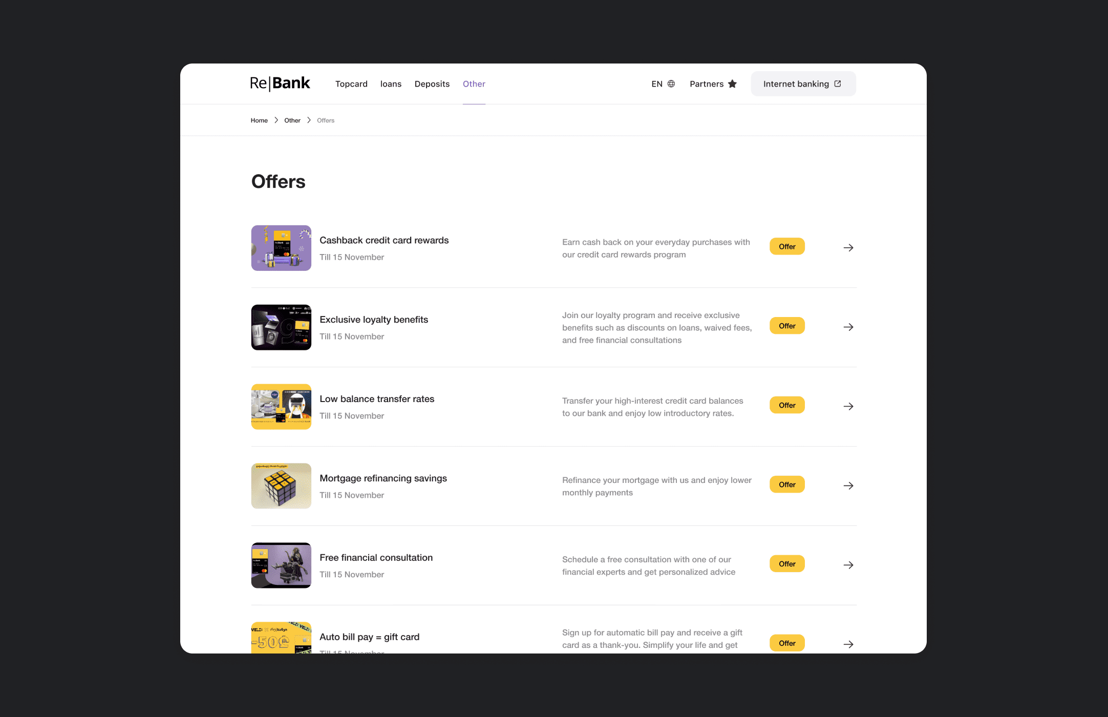
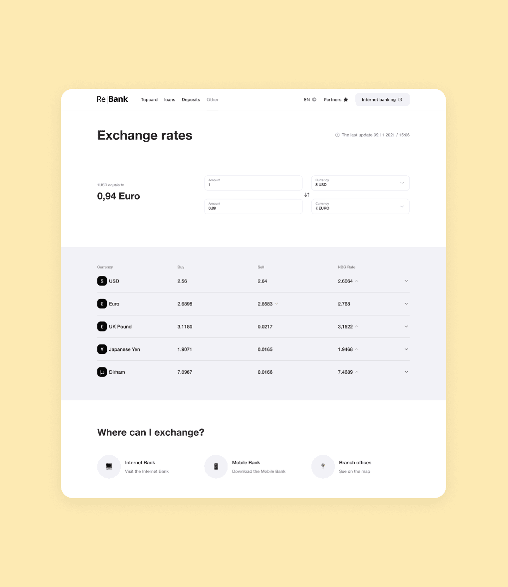
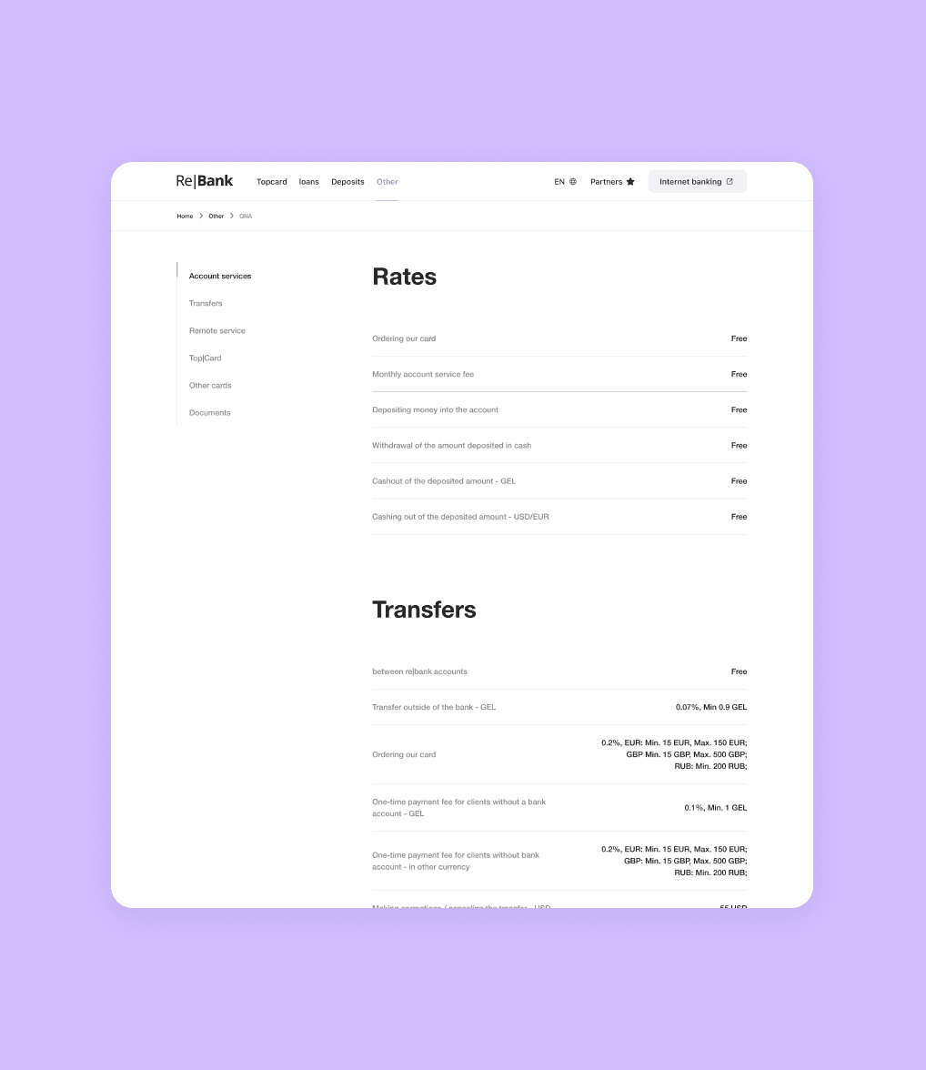
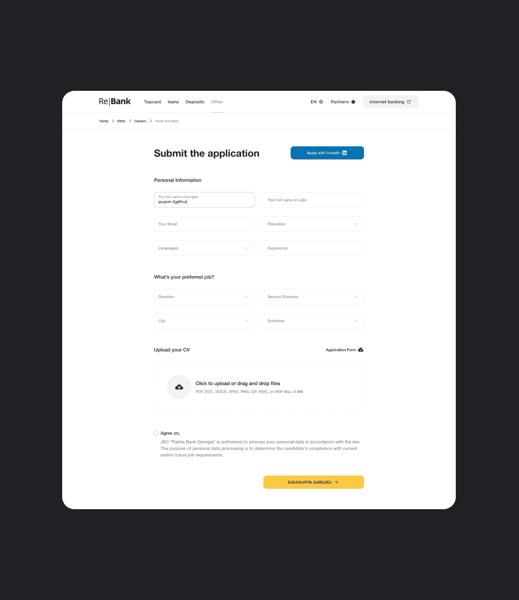
Overall, my aim was to create a website that felt approachable, trustworthy, and human-centered. By incorporating real faces, leveraging the popularity of emojis, and showcasing the card, we were able to address the initial concerns and create a friendlier and more engaging user experience.
