Stack

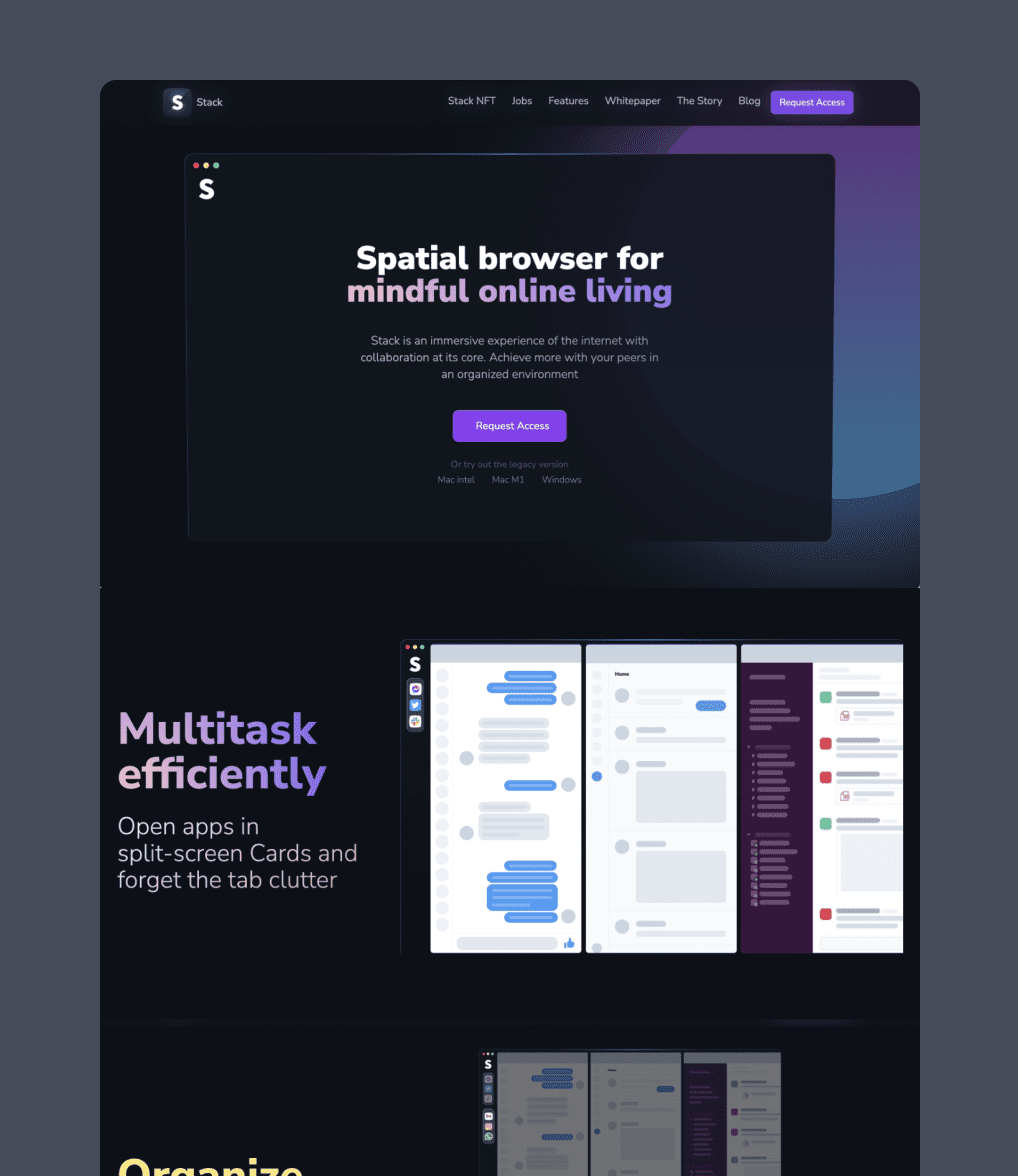
Stack is a revolutionary browser that offers mindful online experiences with its unique features. It surpasses traditional browsers in terms of organization and navigation, replacing Tabs with Cards, Stacks, Spaces, and Verse.

The browser’s design promotes a sense of harmony and speed, providing users with a shortcut-first navigation functionality. With a single click, users can eliminate distractions and achieve a state of flow, maximizing productivity.

Notably, Stack includes built-in collaboration features and is default multiplayer, allowing any non-collaborative app opened in Stack to become multiplayer. This makes remote collaboration feel seamless, akin to being in the same office.

See Live Website

My role

UI/UX Design

Interaction Design

Other designers

Zviad Sitchinava - Creative director

Mariam Qimeridze - Data geek

Holymotors agency

Nick Kumbari - Art Director

Giorgi Avaliani - Creative Director

Anuki Koniashvili - Designer Director

Gio Vasadze - Lead Designer

Gurika Chokheli - Animation Lead

Date

2022 Mar - 2022 Nov
Brief & old version

When Stack set out to revolutionize the way we work and collaborate, they were armed with a product, a style guide, and a website. However, they soon realized that the limitations of the old language were holding them back from incorporating advanced features such as collaboration, space view, etc… That’s when I joined the team, and together, we embarked on a journey to rewrite the product and redefine the very essence of Stack.

We understood that in order to make a lasting impact, we needed to do more than just improve the product; we needed to convey its underlying philosophy in a way that would resonate with our users. To accomplish this, we sought external guidance from the brilliant minds at Holymotors, a renowned agency known for their ability to capture the essence of a brand.

Our mission was clear: to define our philosophy in a better way, to communicate it with utmost clarity, and to inspire a new wave of productivity and collaboration. Like the legendary pioneers before us, we aimed to disrupt the status quo and reshape the future of work.

Concept

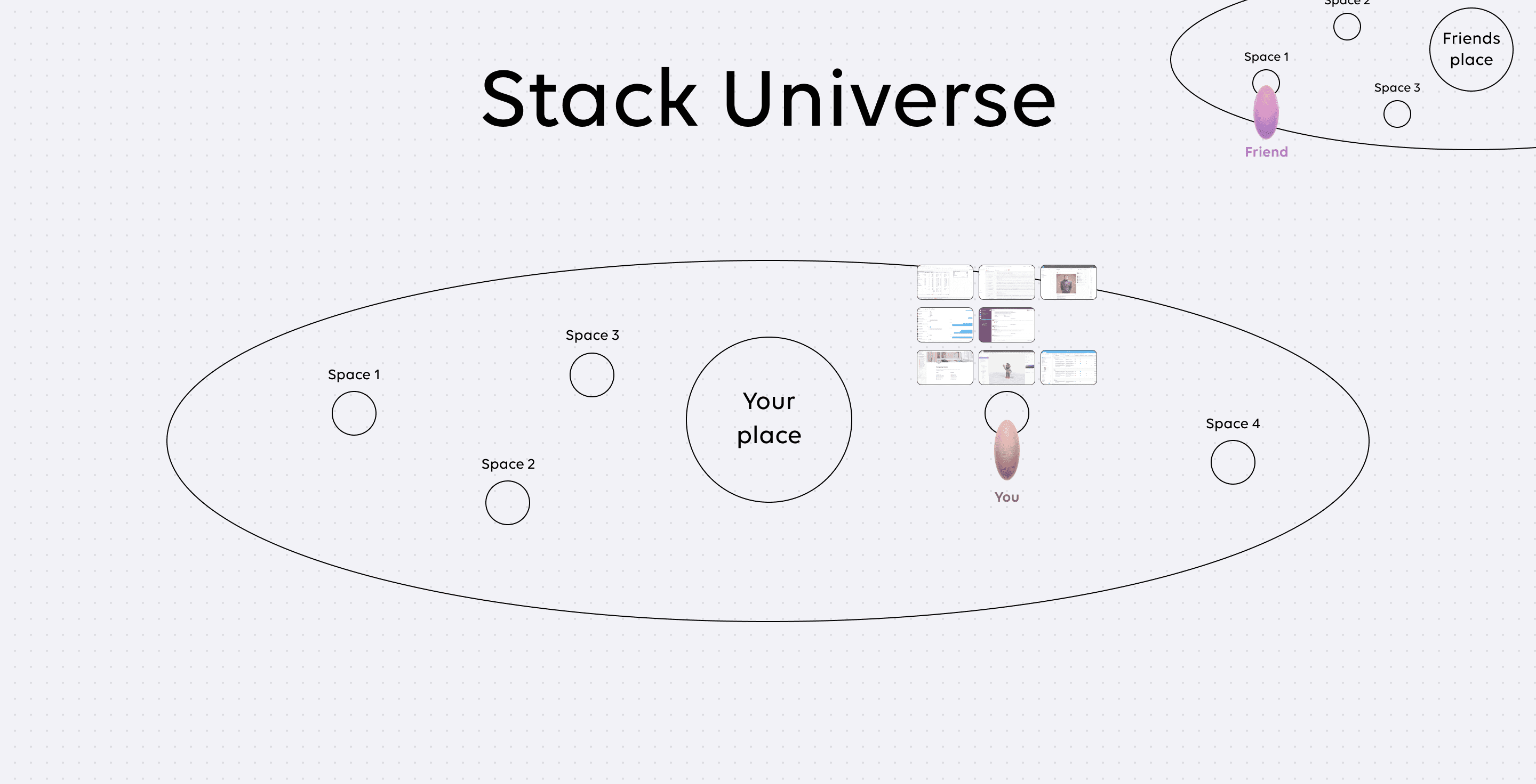
Stack is not just a browser; it is a revolutionary idea, an idea that encompasses the very essence of the internet itself. It is a mindful, spatial, and multiplayer experience that empowers every individual to have their own place in the vast expanse of the internet—the Stack Universe.

Within this extraordinary universe, you have the freedom to create and shape your own spaces. These spaces serve as personalized realms where you can open websites, connect with others, and effortlessly traverse from one space to another. It’s a seamless journey, allowing you to explore and interact with the online world like never before.

Picture this: you and a friend collaborating effortlessly in a shared browsing experience, working together on any website you choose.

This groundbreaking concept lies at the heart of Stack’s design language. Every aspect of its aesthetic has been meticulously crafted to align with this visionary idea. The interface embodies the spatial dimension, fostering a sense of place and purpose within the Stack Universe.

So Stack is like a gateway to a world where individuals can truly thrive, where collaboration knows no bounds.

Visual Inspiration

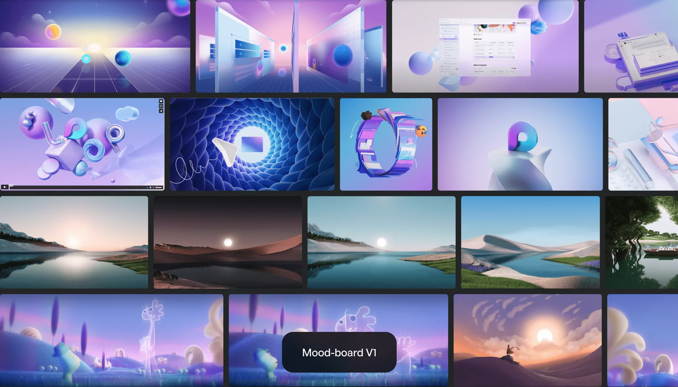
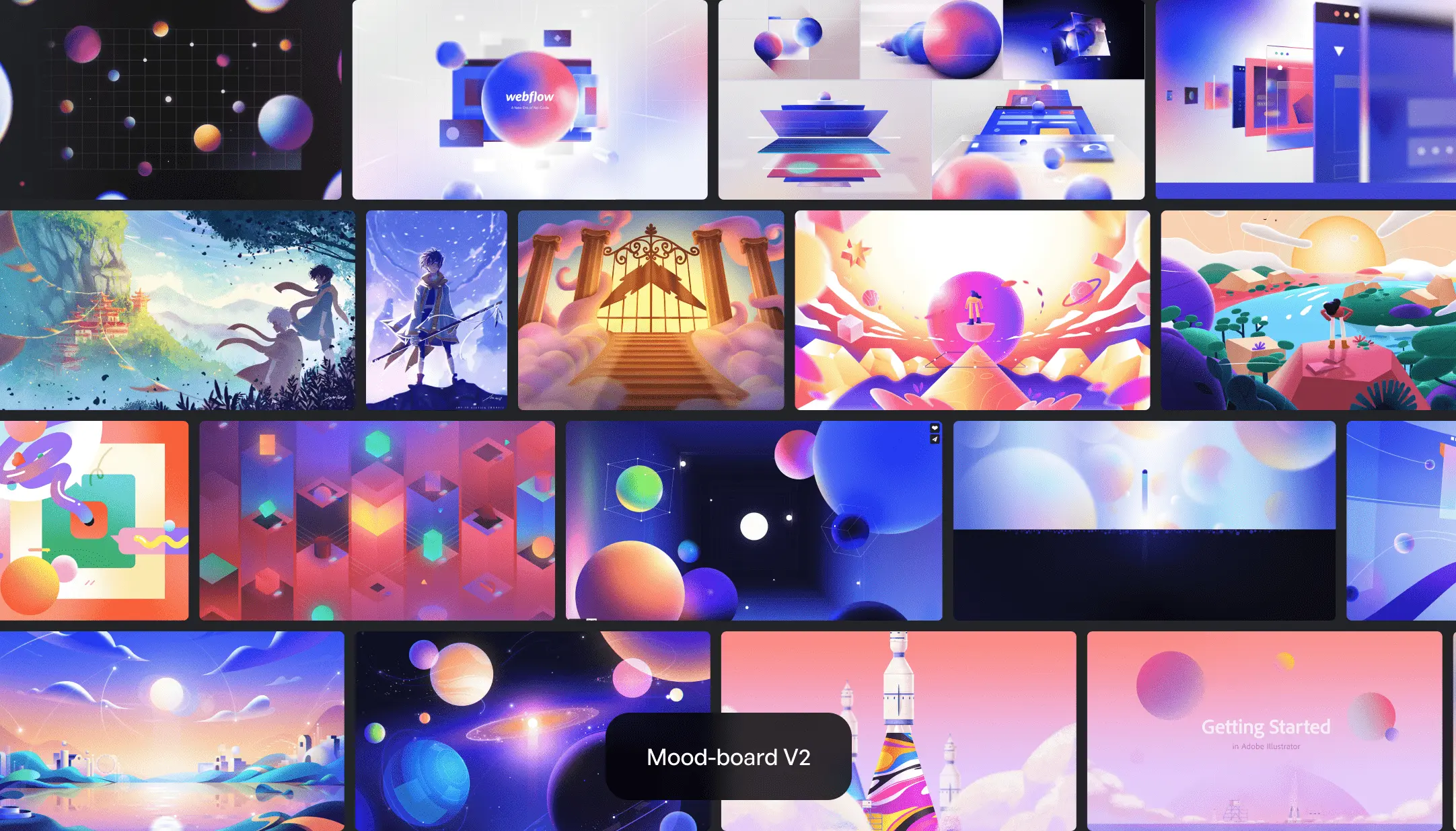
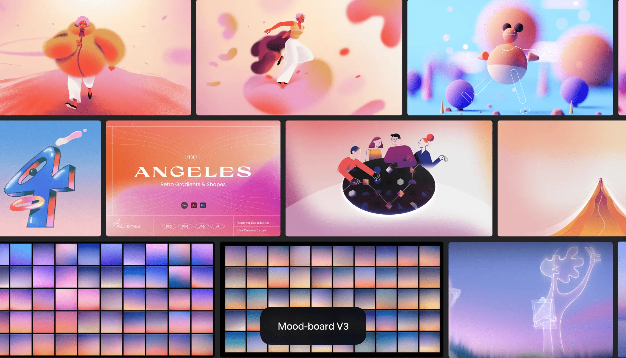
Once we had solidified our philosophy and concept, we delved into the creation of mood boards to envision the visual aesthetics of Stack. Our focus was on discovering mindful colors and exploring the appearance of various worlds and universes. Our primary source of inspiration came from “Soul” by Disney

Rebranding

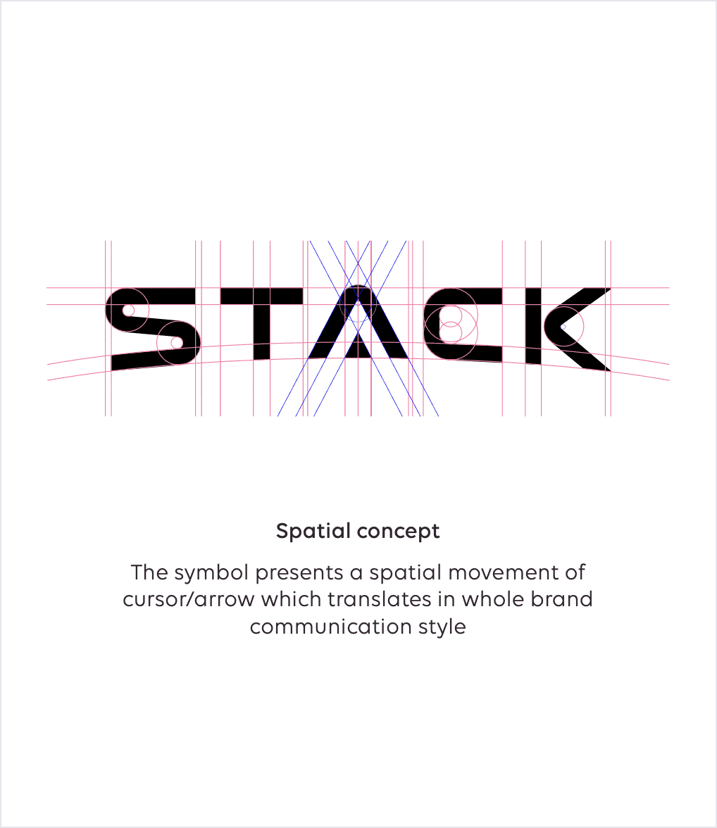
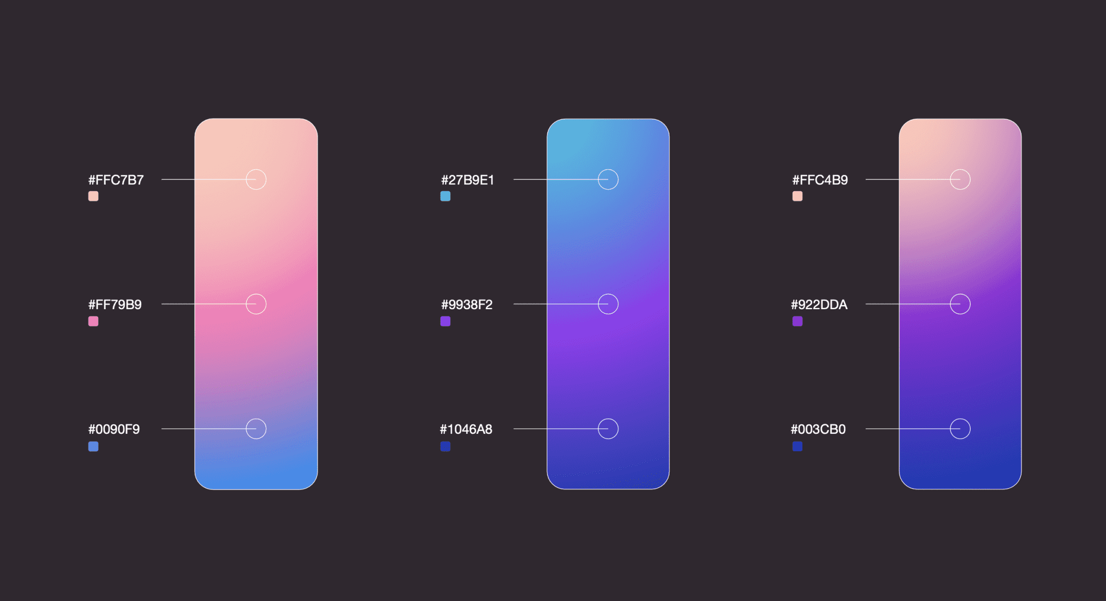
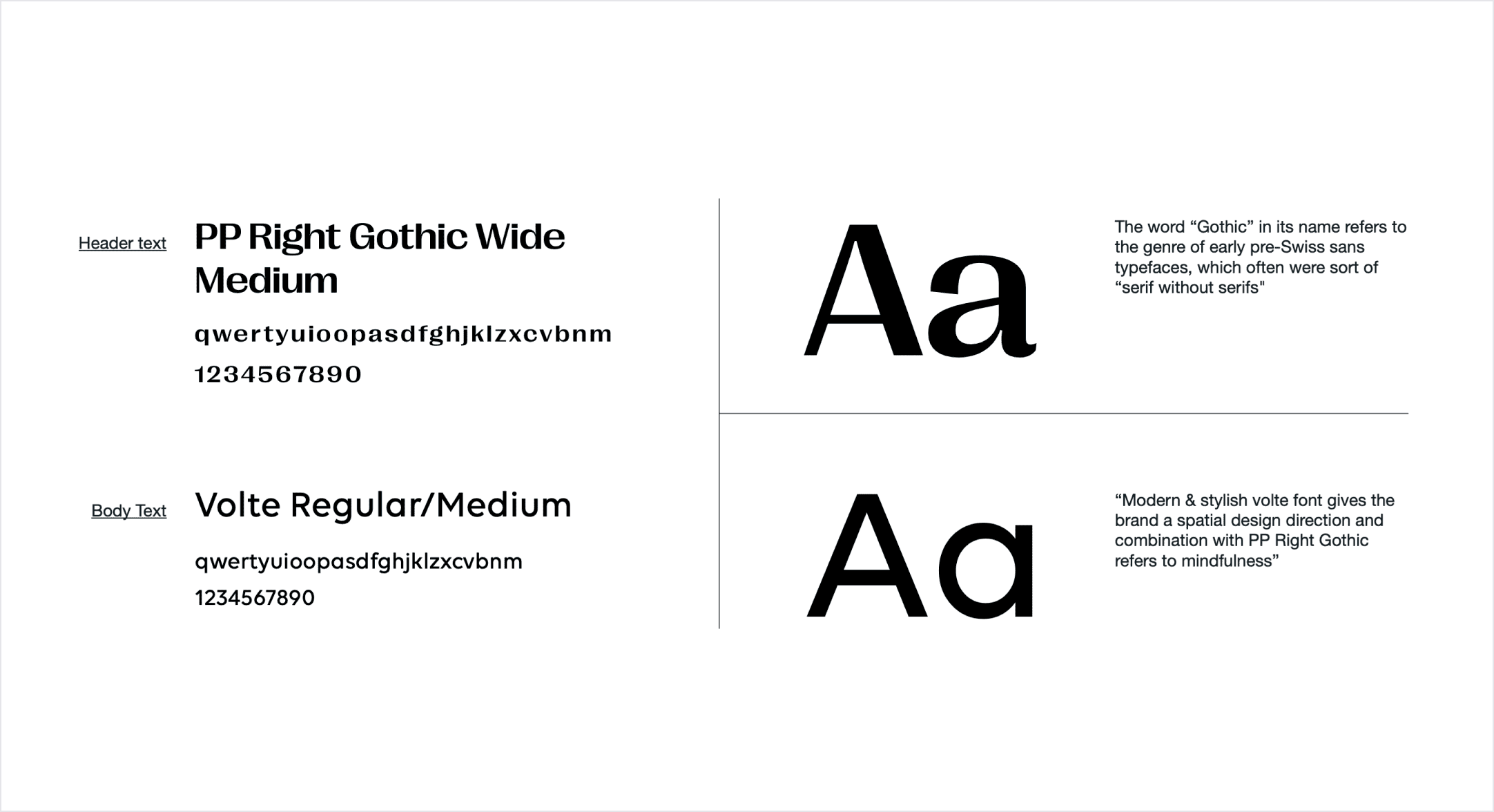
The moment arrived to embark on a rebranding journey, and we enlisted the expertise of a remarkable agency known as Holymotors. Collaborating closely, they revitalized our logo, refreshed our color palette, and revamped our typography. They also envisioned stunning visual universes that aligned with our brand. With their assistance, we established stunning brand guidelines.

Browser

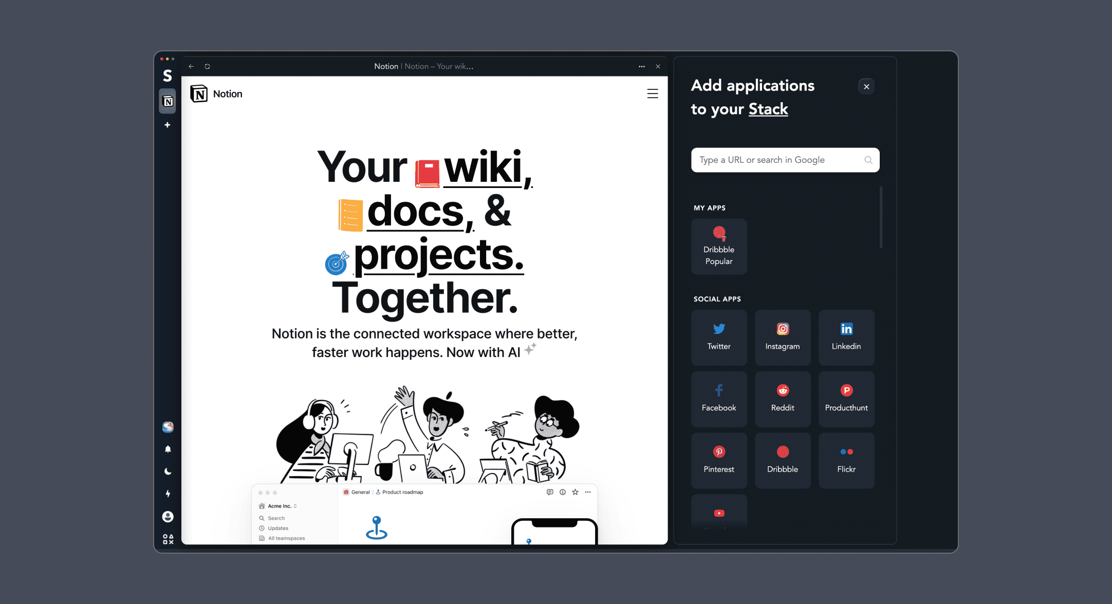
As we crafted the components library, our focus extended to developing a new browser experience. Our priority was to seamlessly transition features from the previous browser while taking the opportunity to reimagine and redesign them. Additionally, we incorporated new and exciting features to enhance the overall user experience.

Cards

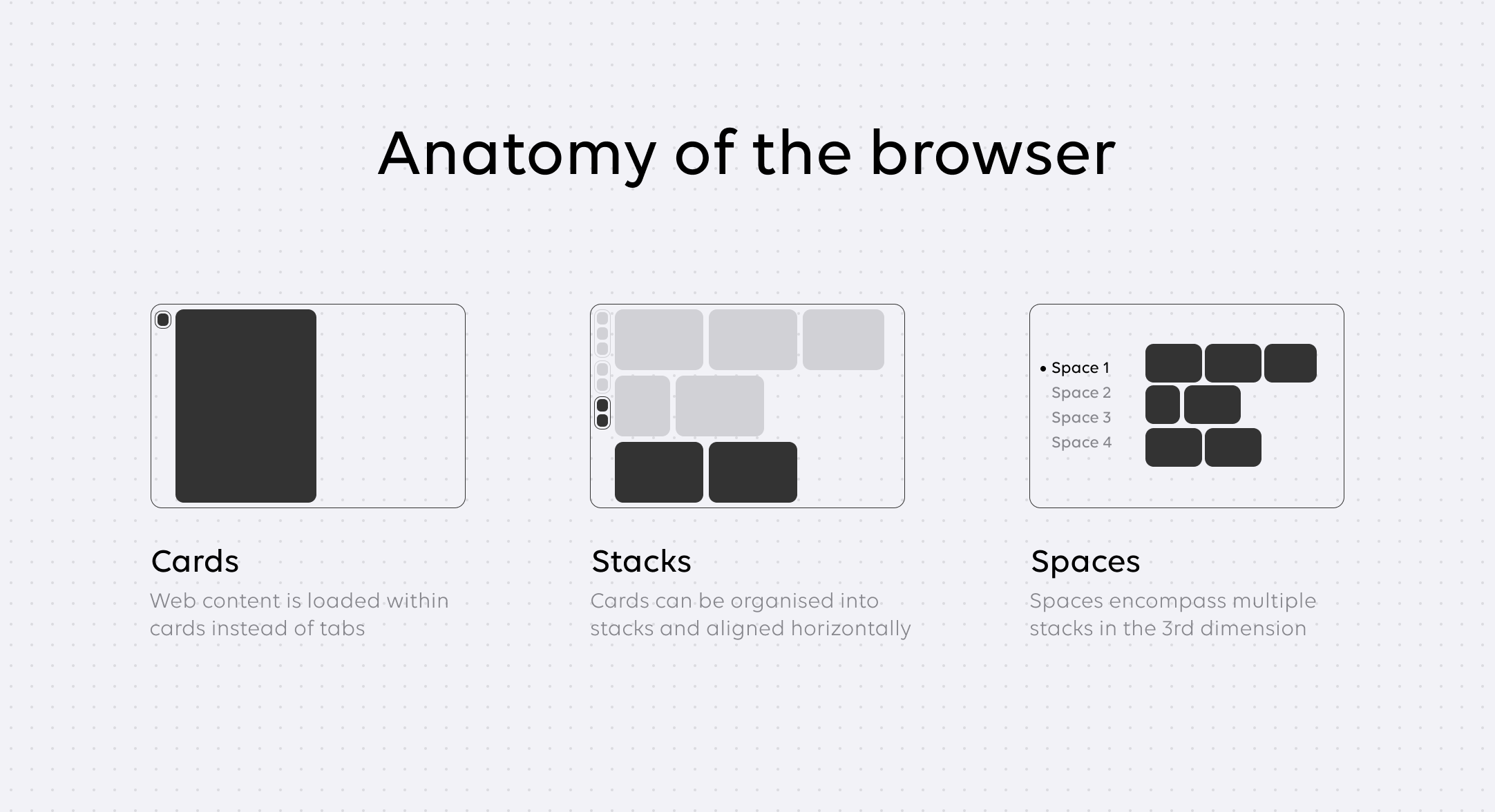
In Stack, instead of tabs, you have cards aligned side by side in a spatial environment. You can even group them into Stacks.

Space view

Users can see all their opened websites at a glance. We also added Space switcher, allowing users to navigate between spaces, edit existing ones, and even create new ones

Multiplayer

Taking inspiration from Figma's multiplayer design capabilities, we aimed to enable users to collaborate on websites just as they do on designs. During the ideation phase, we recognized the value of integrating direct calling functionality within Stack, allowing users to communicate seamlessly while collaborating.

Hey Special...

Special is an assistant inspired by Iron Man's Jarvis. With Special, users can easily perform various actions within the browser, such as muting notifications or clearing browsing history. It's like having a trusted companion in your spaceship, ready to assist you with any task at hand.

Yoke

Just as a spaceship needs a steering wheel, Ziko had a brilliant idea inspired by airplanes. Drawing inspiration from the Yoke in aircraft, we decided to incorporate a similar concept and design into our browser.
Website

In our pursuit of launching the new product, we embarked on designing a fresh website. Embracing our concept of a universe backdrop, we created a visually captivating layout where the loaded website card rests atop the universe. As users scroll, they are treated to glimpses of different views from the universe, creating a dynamic and immersive experience. The footer section also offers a glimpse into the universe, adding a touch of intrigue and continuity to the design.

Home Page

We had 3 core goals. Firstly, to showcase the product. Secondly, to build trust. Lastly, we wanted to inform users about our NFT campaign.

Pricing

Partner's page serves as a dedicated space where cardholders can discover a wide range of offers from our partner companies.

Download

Individuals have the opportunity to access various financial services such as loans, instalments, and the option to refinance existing ones from other banks.

NFT

Individuals have the opportunity to access various financial services such as loans, instalments, and the option to refinance existing ones from other banks.
People About us

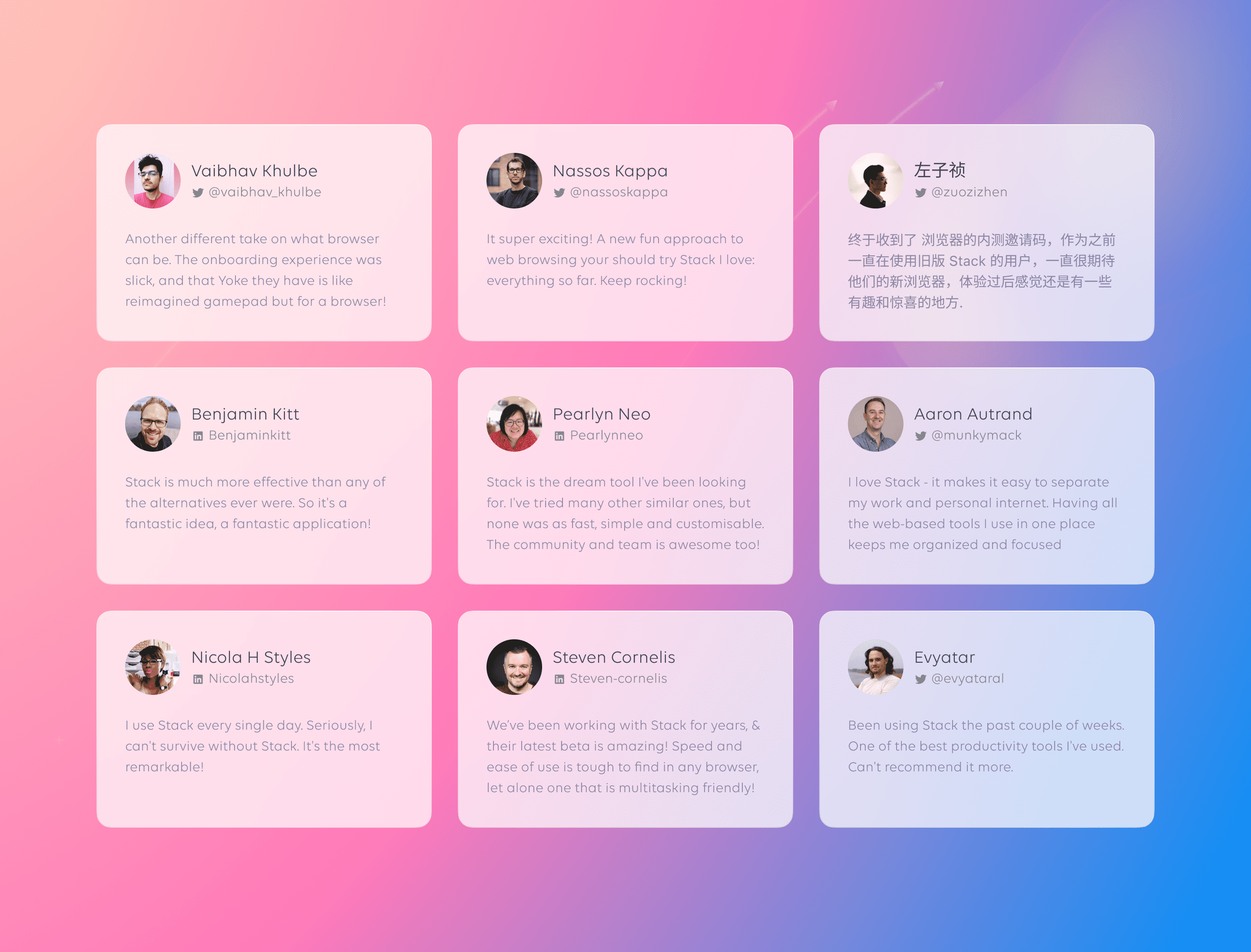
After the launch, we received an array of positive feedback from both existing and new users. Here are a few inspiring examples:

🇳🇱 Dachi Gubadze

🇳🇱 Dachi Gubadze

Co-founder & COO

Petro is an inventive designer with immense knowledge and proficiency. His high sense of responsibility is noteworthy, and working with him has been nothing but a joy. He upholds a high level of professionalism and always delivers what he promises in a timely manner—a rarity in today's world of agencies and remote work. Hence, based on my personal experience, I strongly recommend Petro for any project; his remarkable abilities make him a powerful addition to any team."

Loading...