OneRegTime

OneRagtime is a VC fund-as-a-platform specialized in sourcing, financing and scaling early-stage tech startups from across Europe.

The main goal is to connect investors and entrepreneurs using AI logics, to build a competence centre through the community, and to support them.

See Live Website

My role

UX/UI Design

Interaction design

Product design

Other people

Inés Melgá - UI/UX Designer

Daphné Schuller - Investor catalyst

Gautier Mignot - Investor catalyst

Date

2020 Sep - 2021 Sep (full time job)

Research

My involvement with the company began with books, movies, and interviews with entrepreneurs and investors to better understand how everything works and how they see the world.

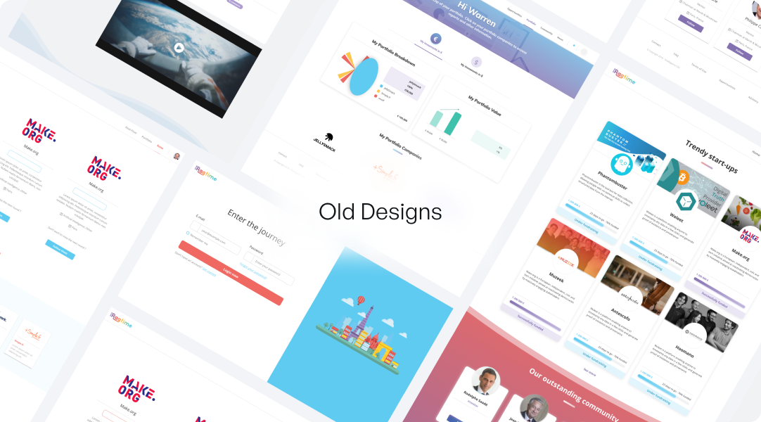
Main goal was to assist them in expanding their business throughout the EU and the United States. To achieve that goal, we stated that we must first build design processes correctly and begin creating a design system in which we will have all of the guidelines and rules for communicating our design language to users through our 3 main products.I also had to redesign the main product for the business platform, which where all of the interaction between the investor and the entrepreneur takes place.

After conducting research, I discovered that our two target audiences were very different from one another. The average age for investors was 55 or 55+, while the average age for entrepreneurs was 30 or 30+, and they had completely different understandings of technology.

The huge design challenge was that the company’s founder liked it when there were too many colours together and nothing was prioritised, so we had to keep colours in a smart way so as not to break basic design rules.
Concept

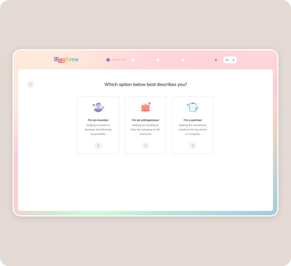
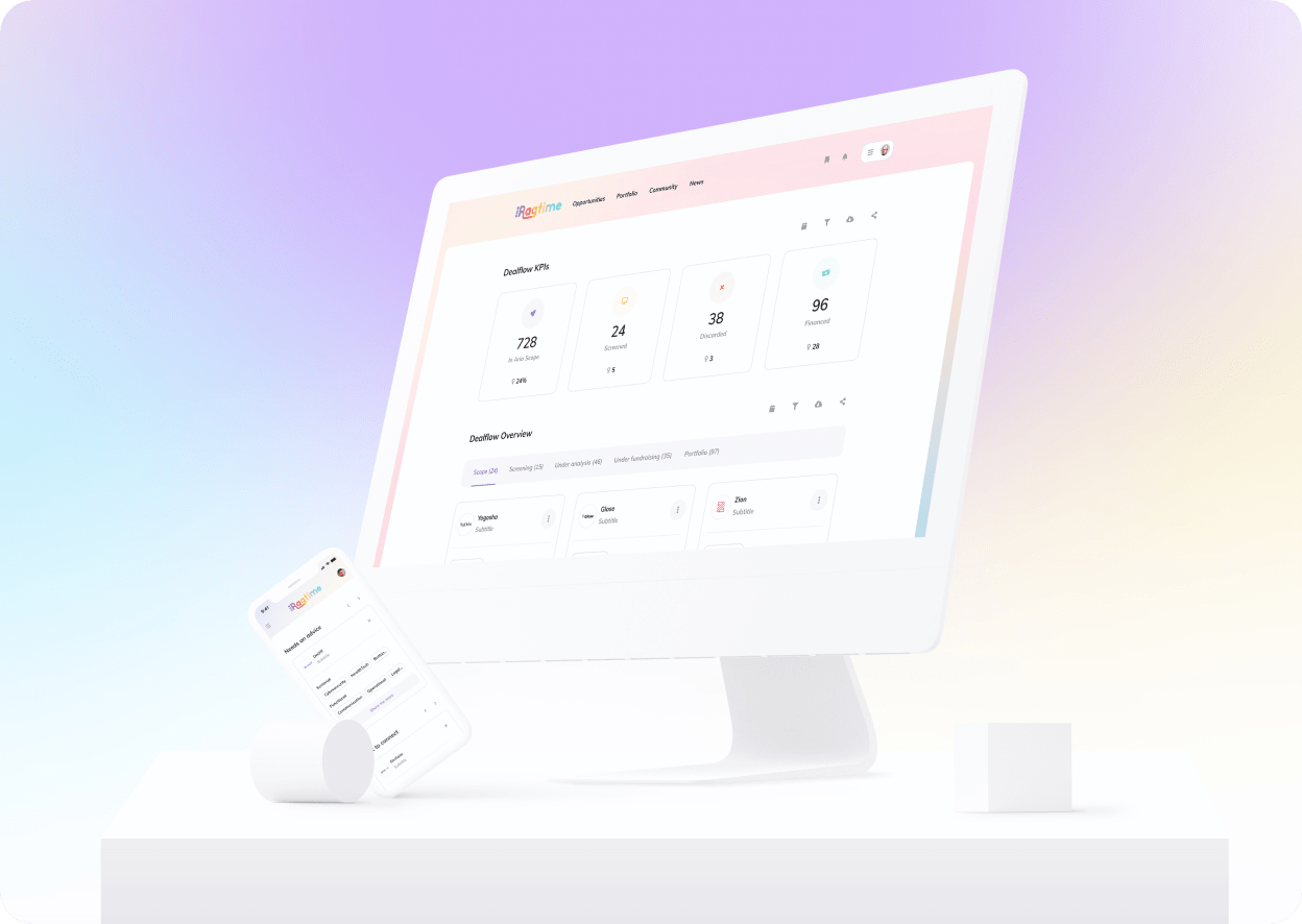
The main visual challenge for us was to keep colours and gradients in the designs while also keeping it clean and not overwhelming. So we decided to use gradients as a background and only show them on the edges of the right and left corners, as well as the top and bottom. The plan is for each page to have its own gradient (we had 7 gradients in summary)

Sketches

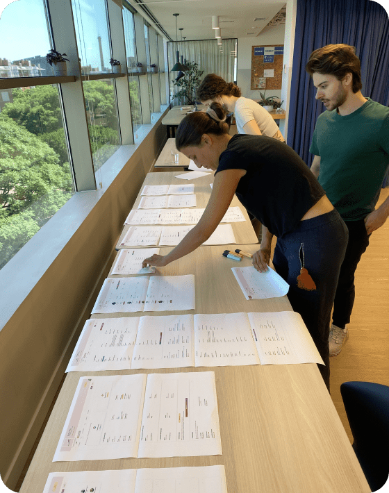
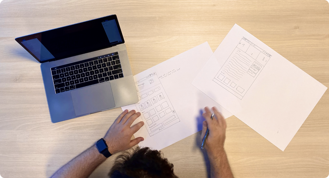
Before I started sketching, I did some exercises with clients to figure out how they imagined things and what they really wanted.

Sitemap

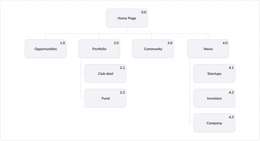
Following the completion of research and confirmation sketches and ideas, I needed to create a plan for how we were going to structure the information and how many pages we would have.

Wireframes

Last but not least, in the UX process, I created wireframes to see how our product will look and what the overall user experience would be.

Visual Language

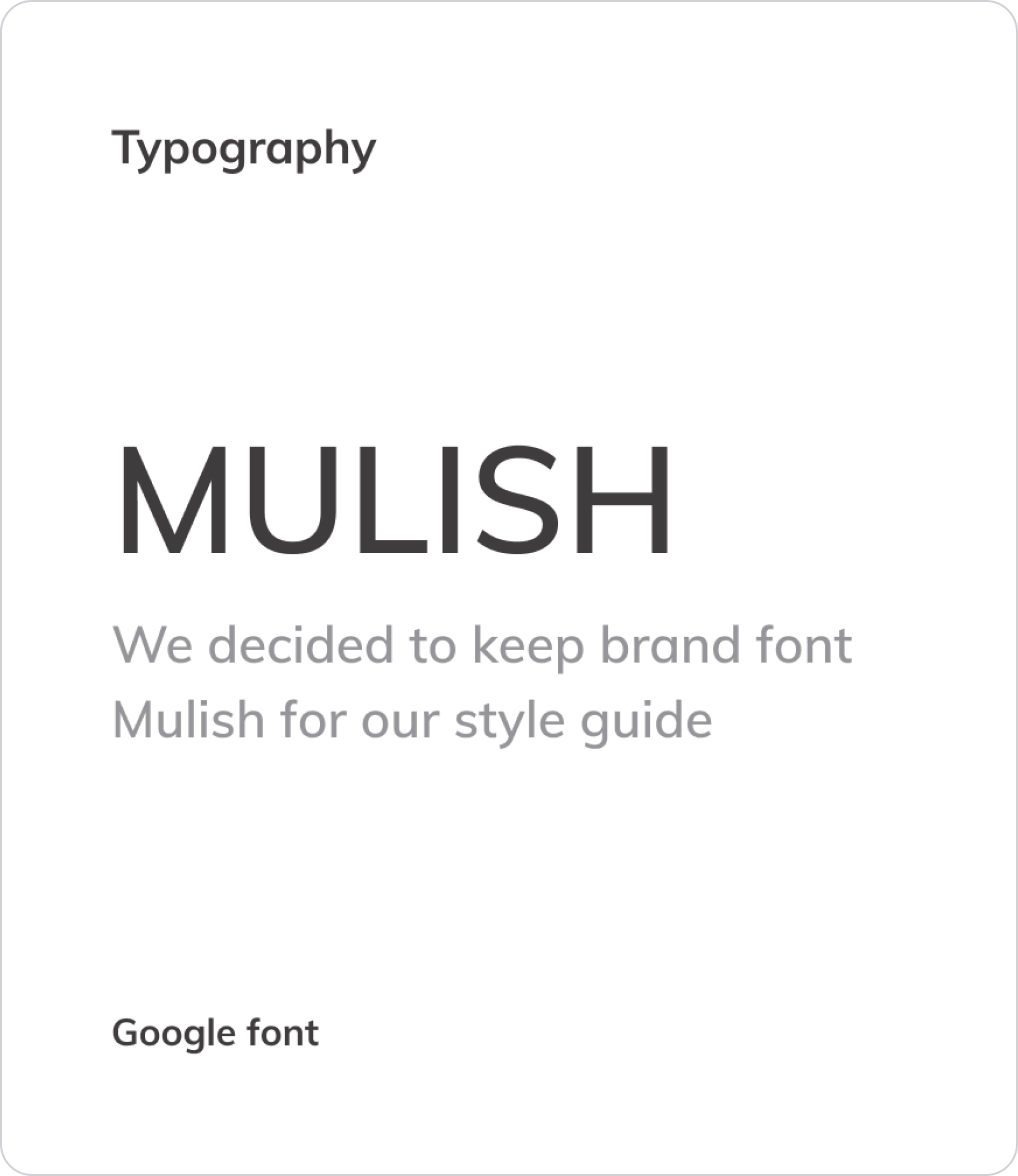
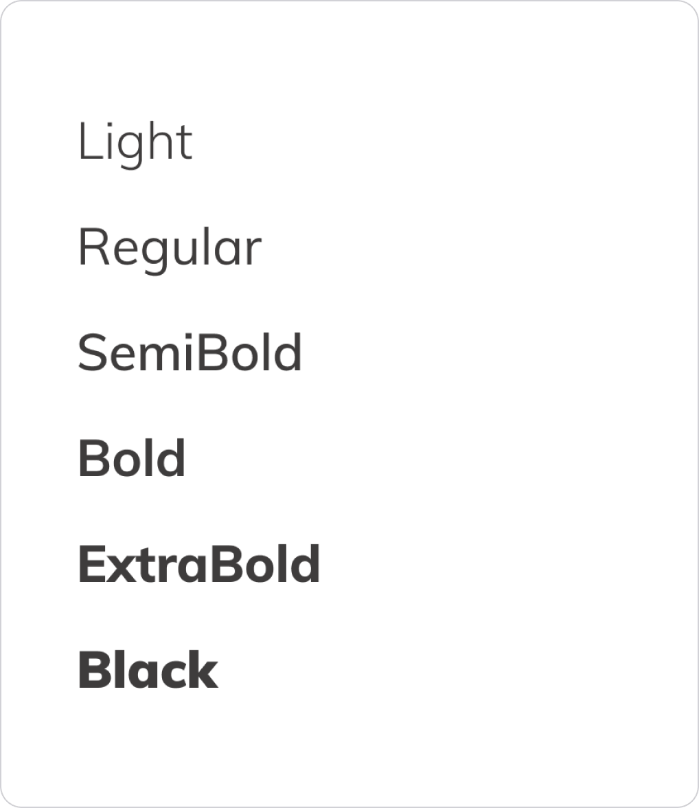
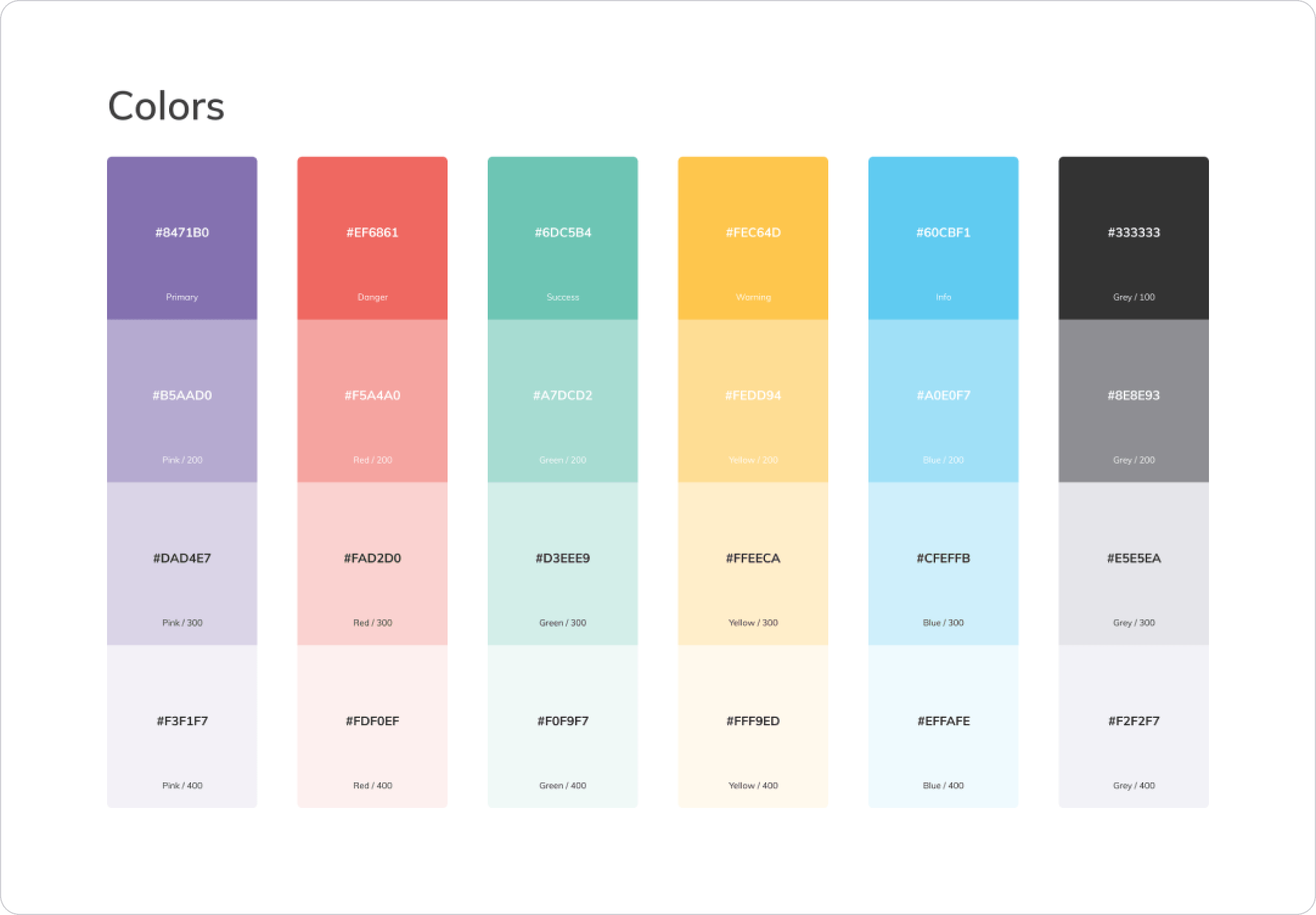
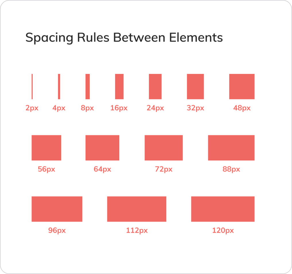
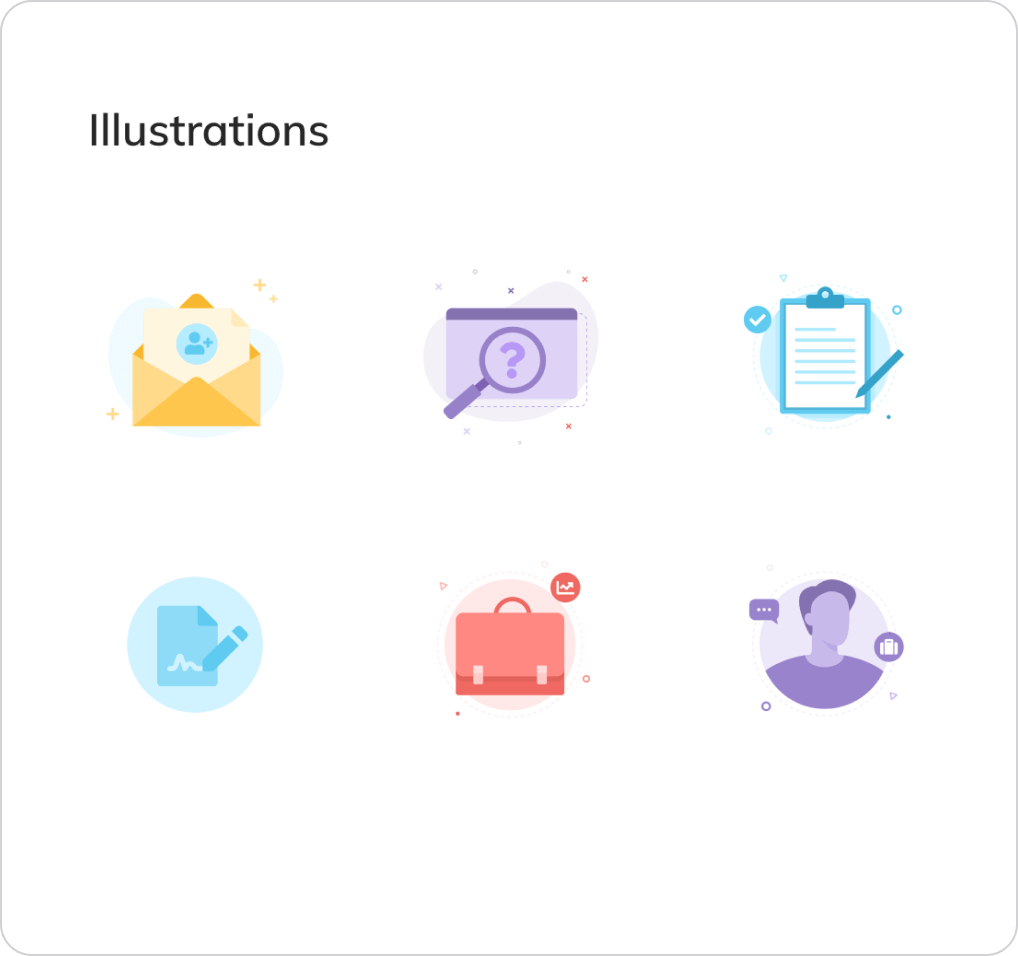
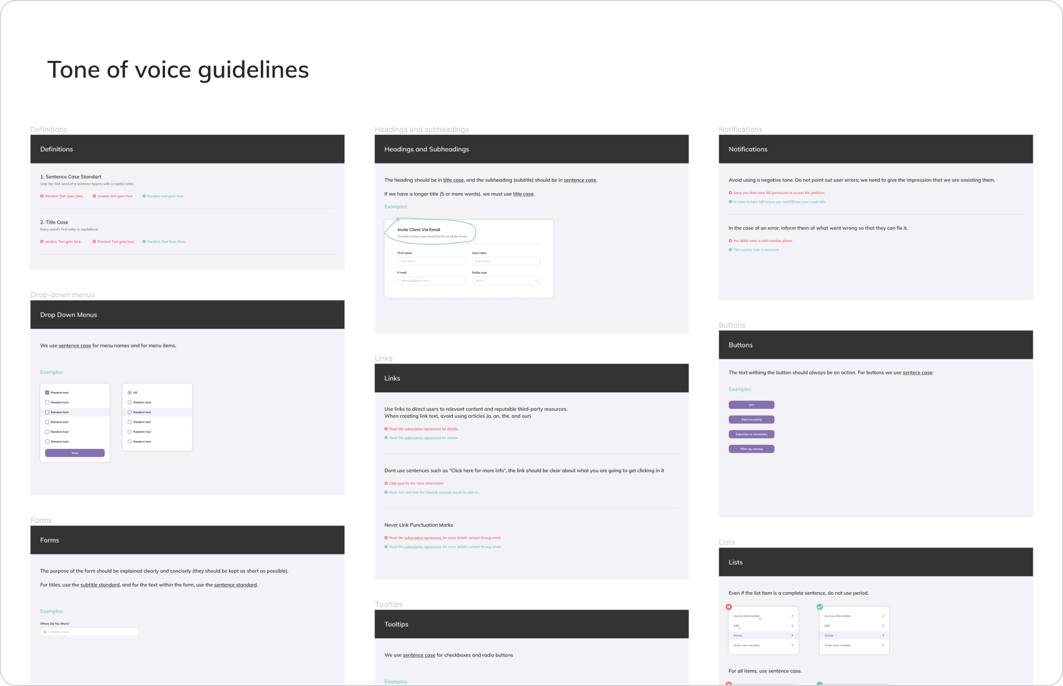
After completing the ux process, I began working on the UI. The first step was to determine how we would communicate the design to our customers. I began the process by creating a style guide that includes typography, colors, shadows, icons, illustrations, grids, and basic interaction rules.
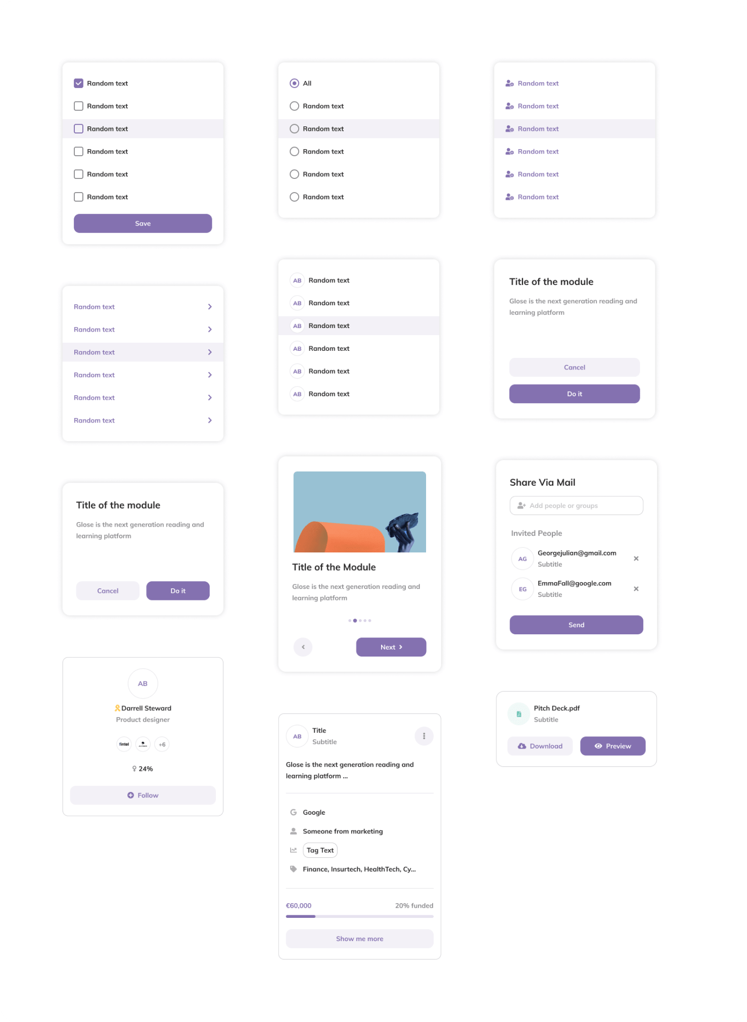
UI components

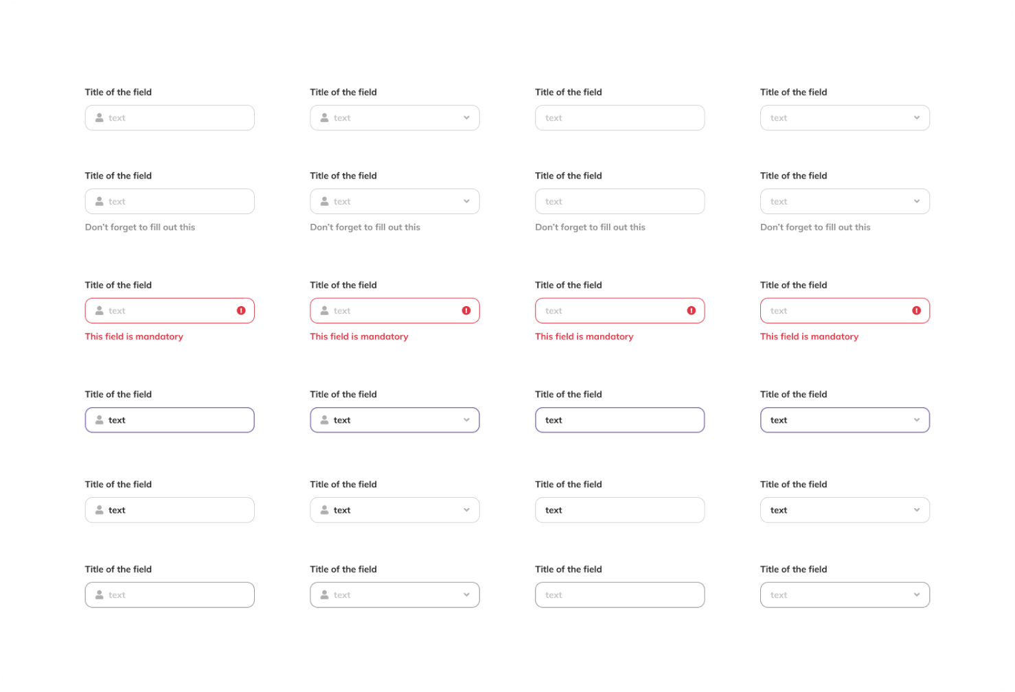
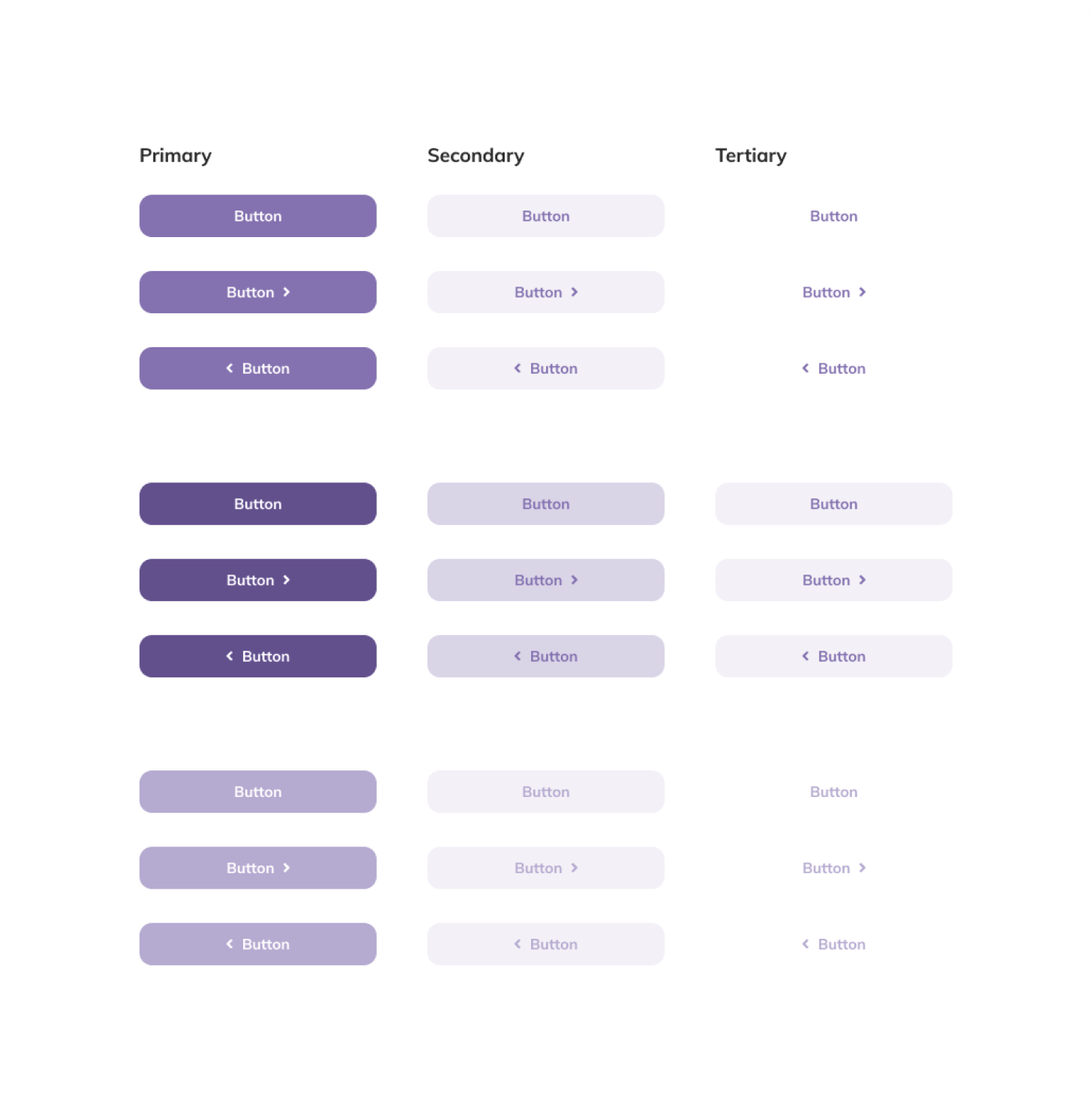
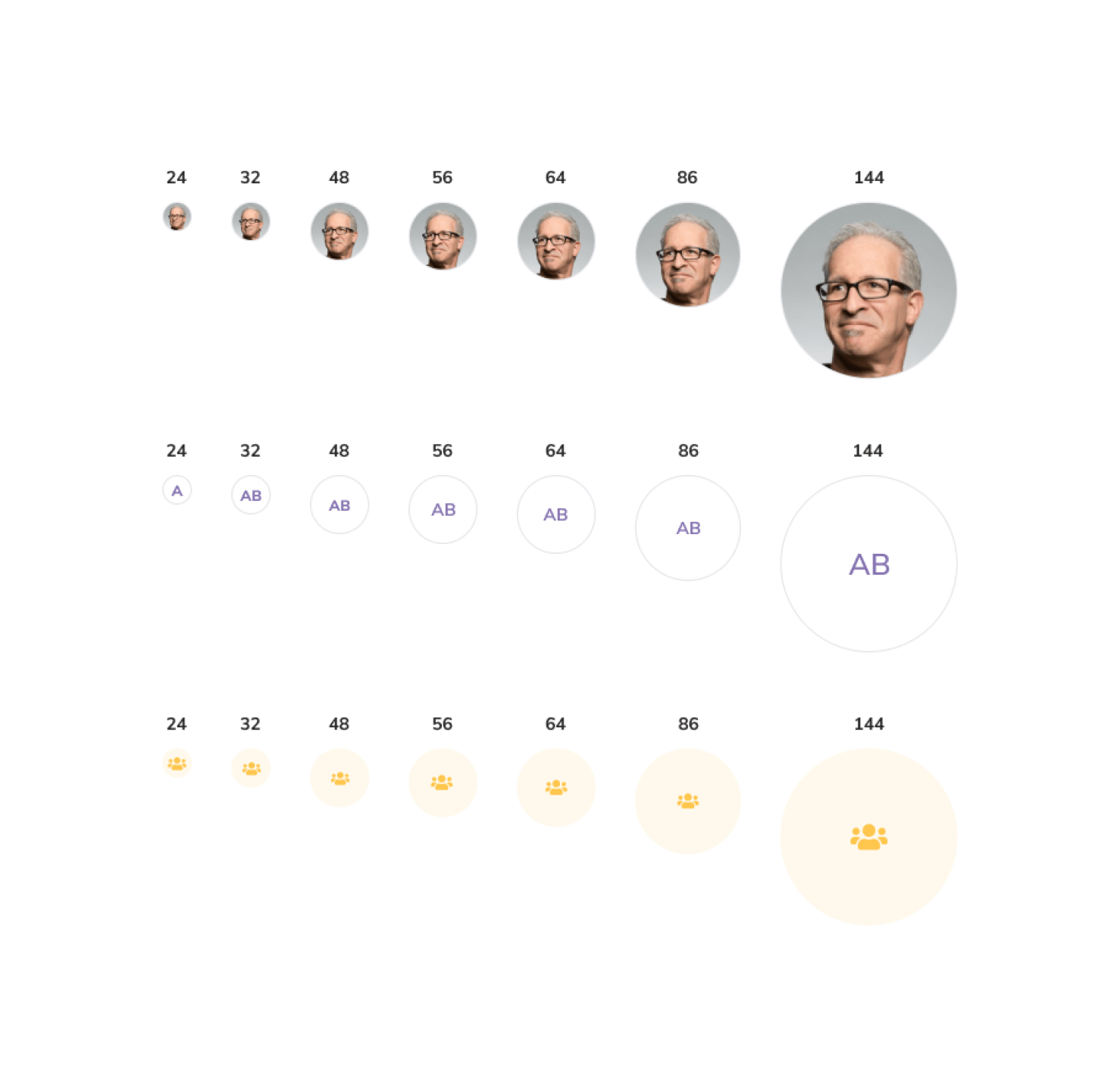
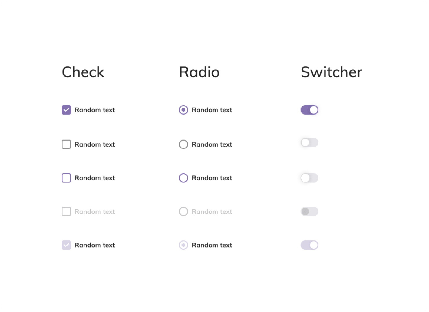
After developing basic visual language rules, I began working on UI design while also adding components to the library.
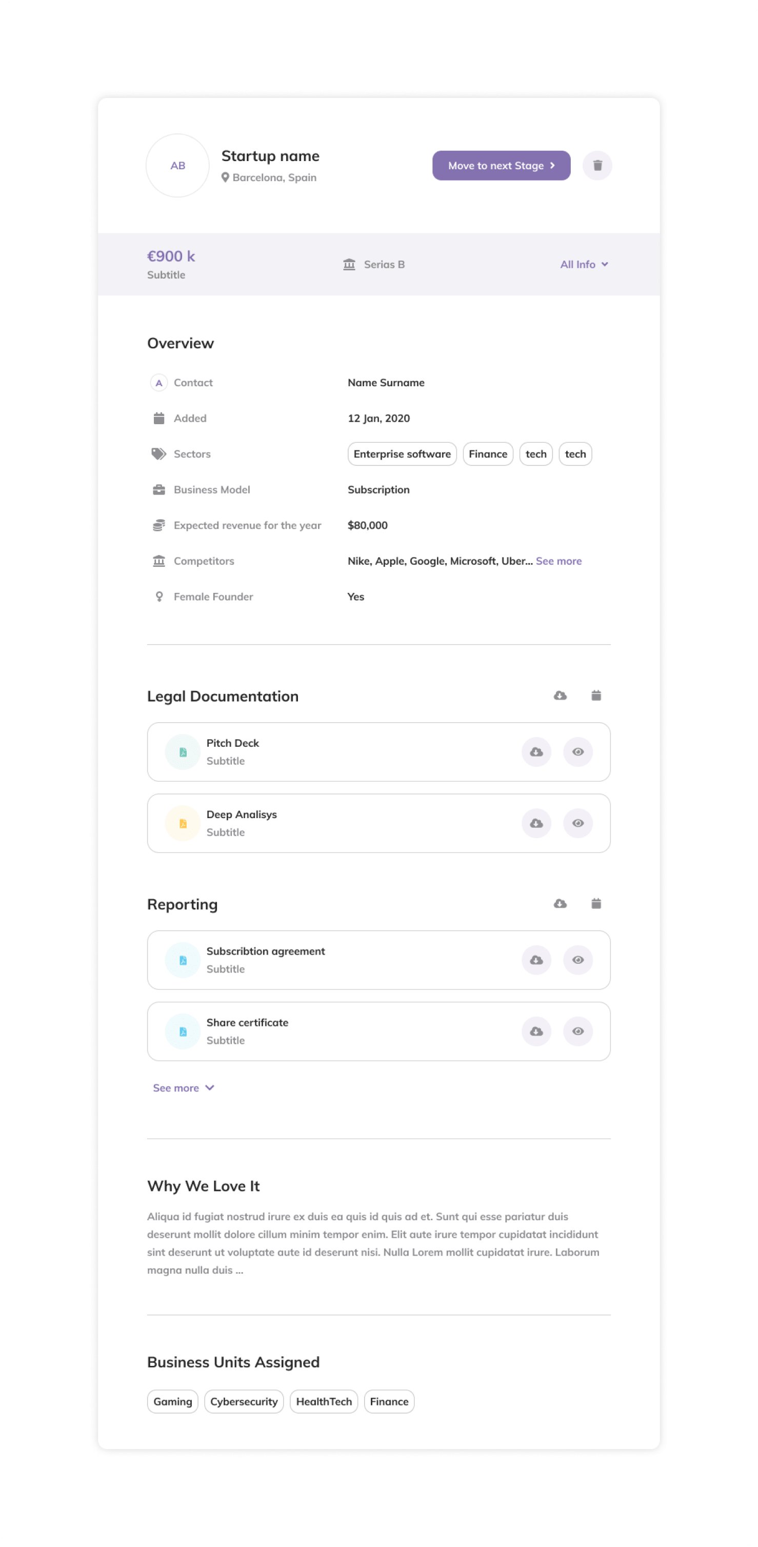
Final UI

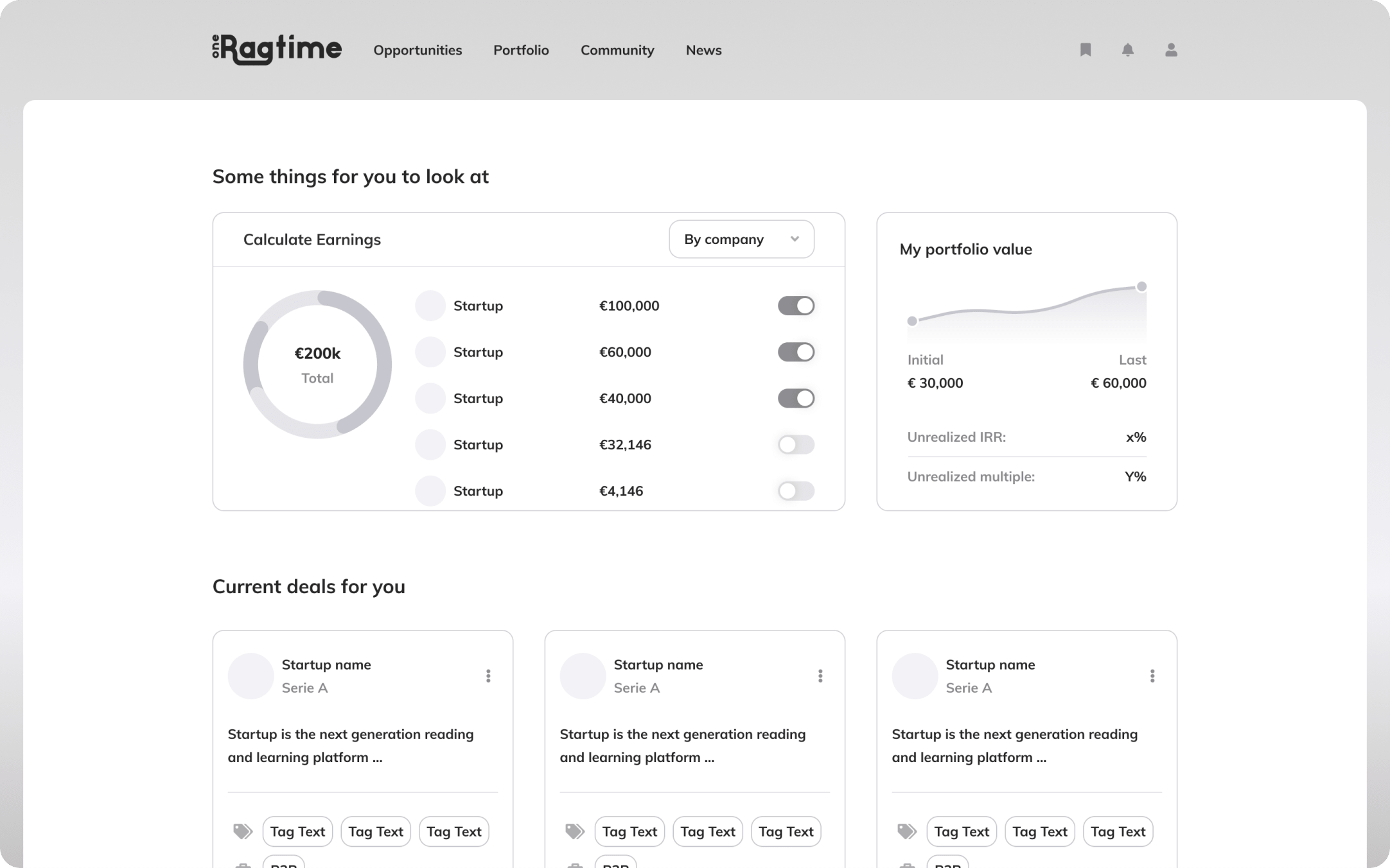
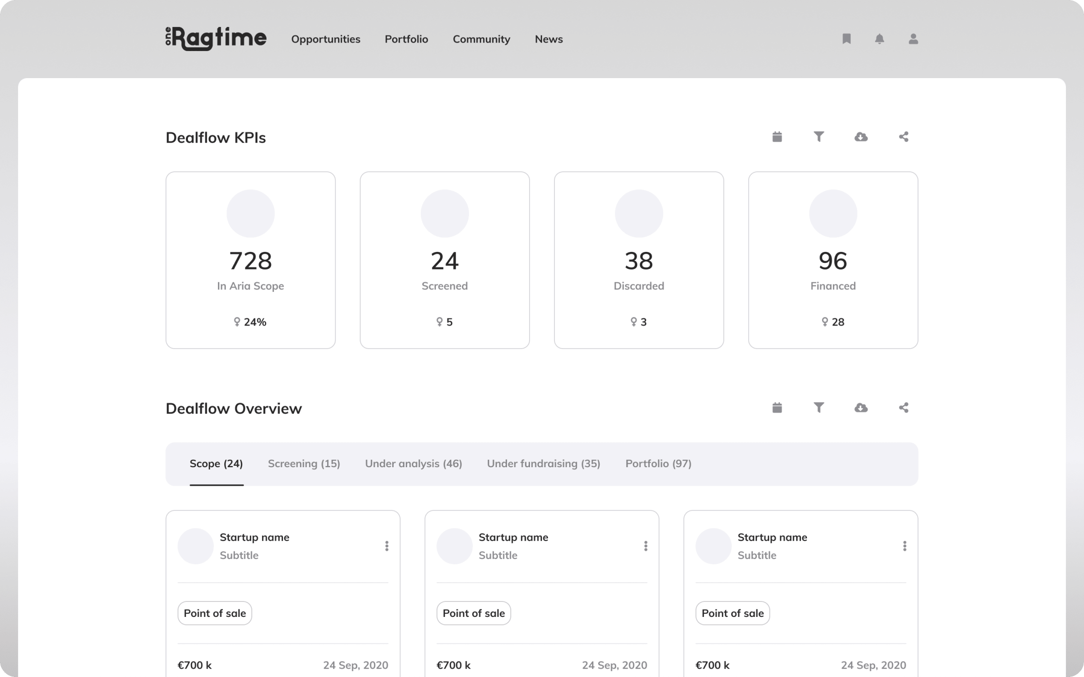
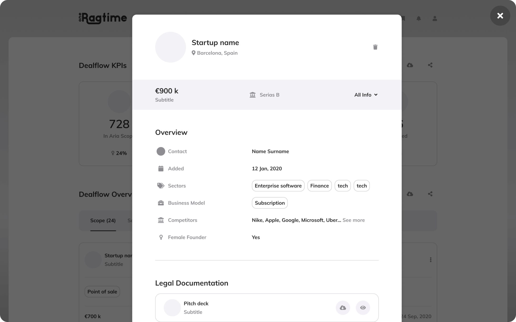
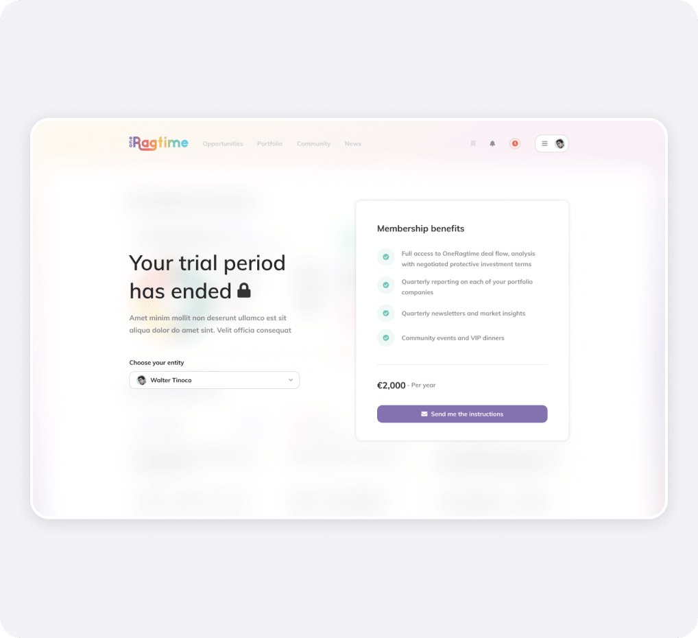
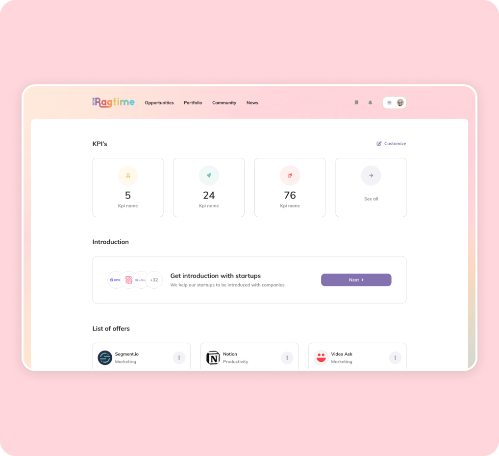
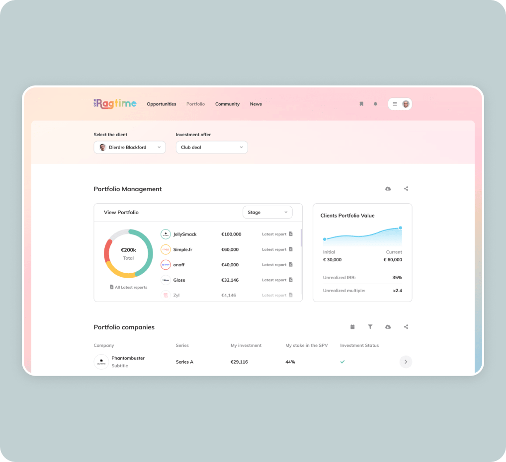
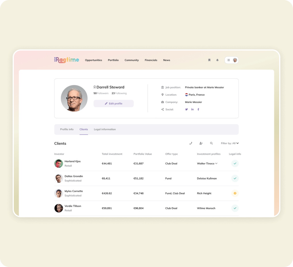
It was time to design all of the pages and states based on the wireframes, style guide, and components.

loader of the website

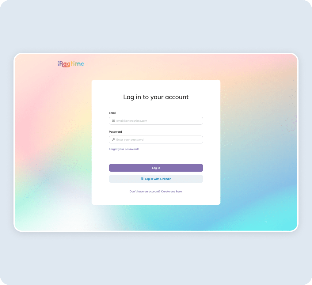
Authorisation

Scrolling and opening card on home page

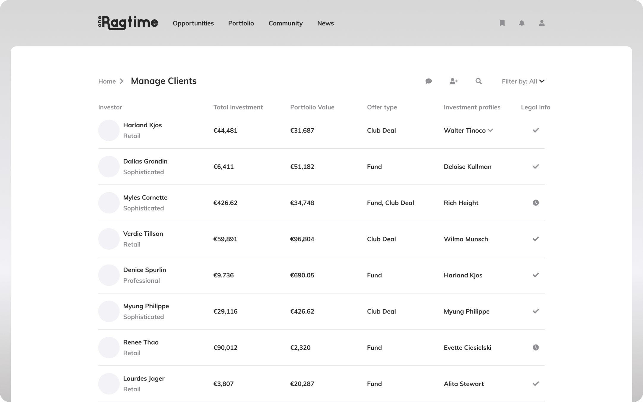
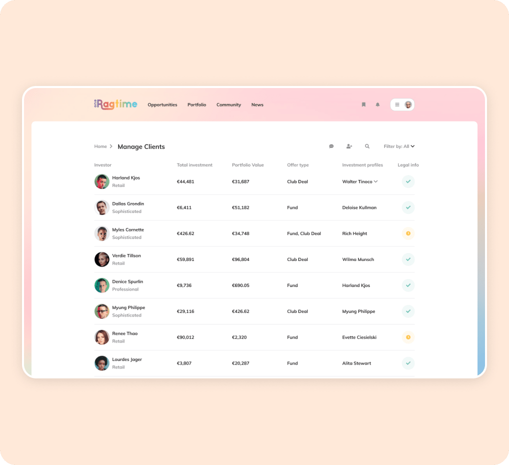
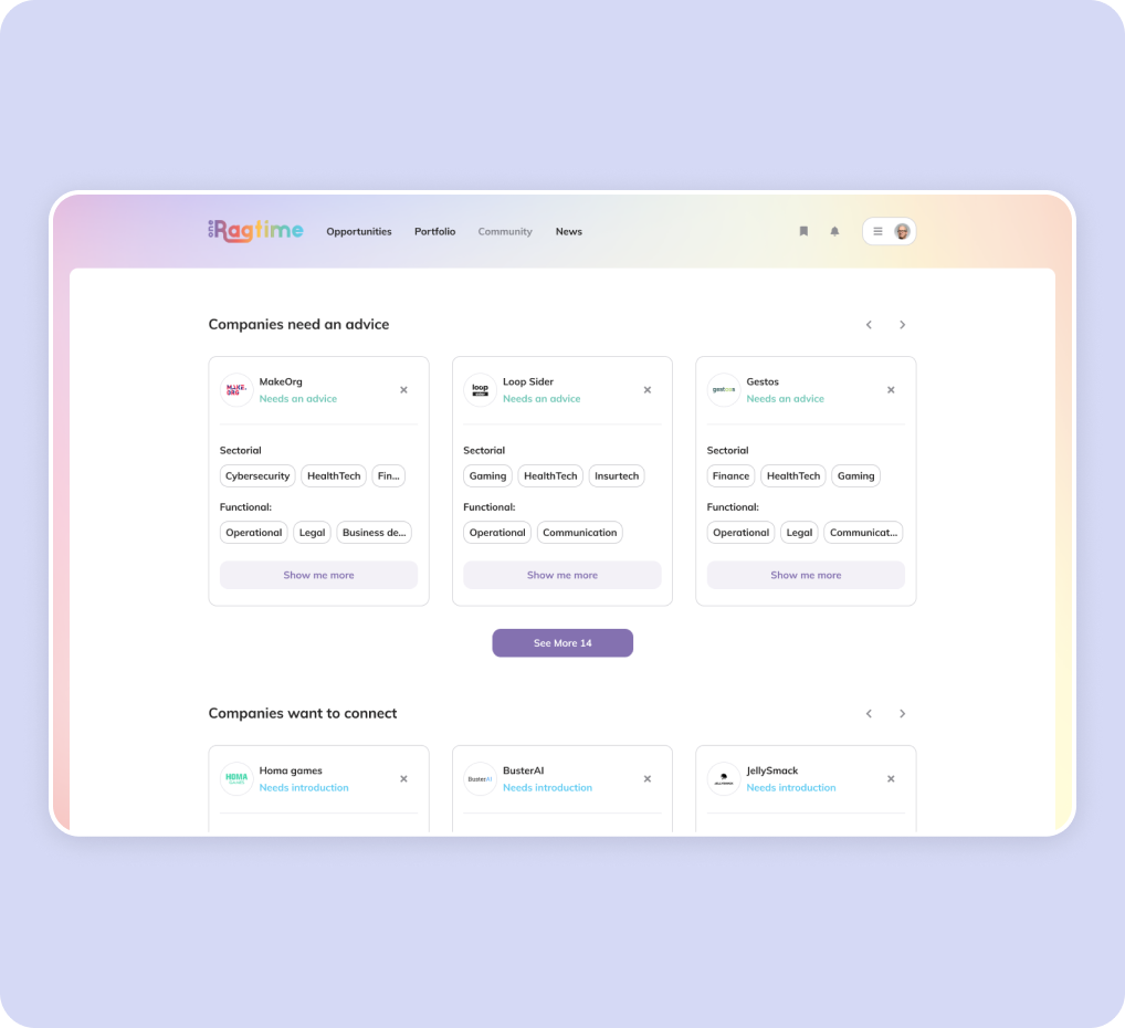
Other pages

Here you can see all of the important other pages
Responsives

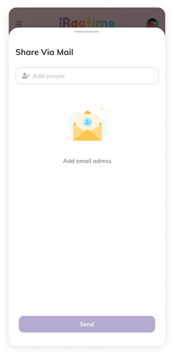
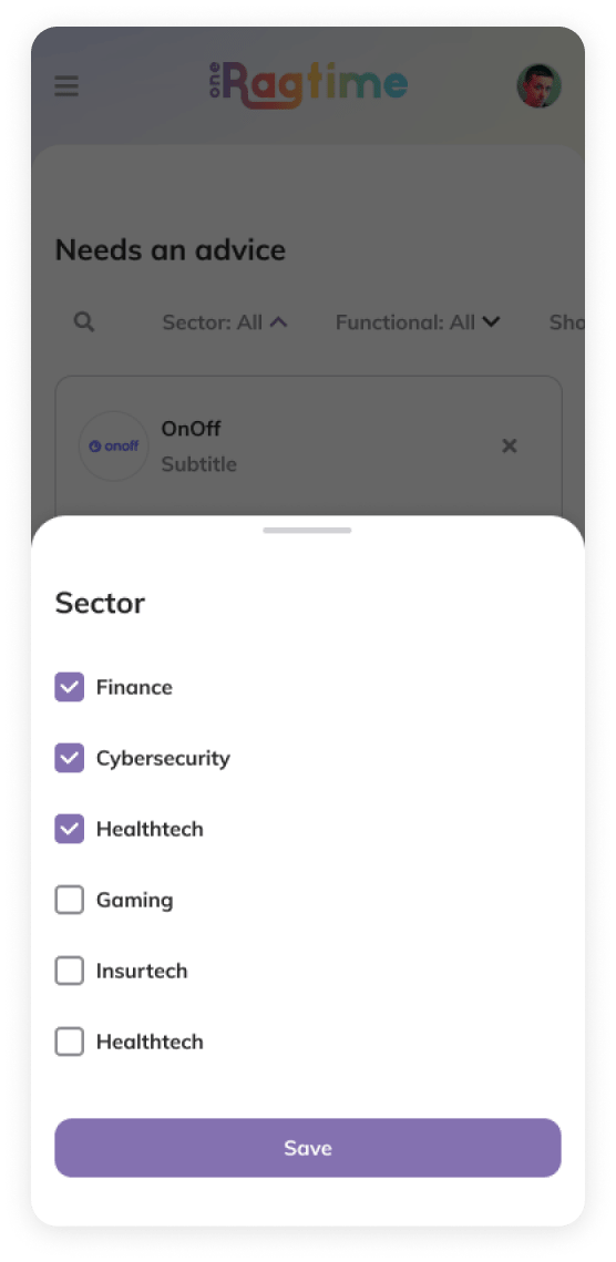
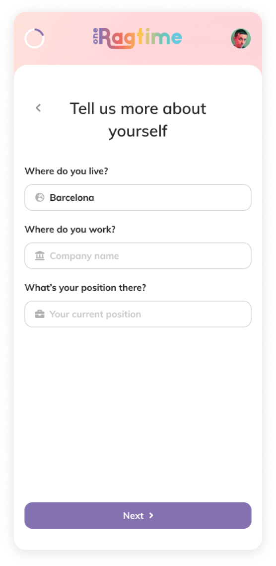
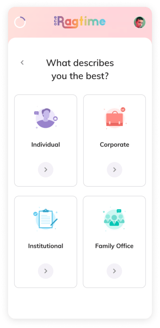
According to research, nearly 42% of our users use mobile, so we needed to ensure that they had the same experience on their smartphones.

🇫🇷 Gautier Mignot

🇫🇷 Gautier Mignot

Product Catalyst at OneRagtime

We were glad to have Davit in the team, he was a real team player. He brought a fresh eye to our products and was innovative in his approach."

Loading...